A couple of days ago, somebody tweeted a great looking CSS3 example. I was absolutely stunned by the example And all that Malarkey created and was wondering how he was able to produce that kind of effect. I knew about the CSS3 transition property, but how to create that 3d effect?
At that point, I started digging through the Safari Reference Library, where I eventually found the Safari CSS Visual Effects Guide: Transforms page. This page describes a CSS property I’ve never seen before: -webkit-perspective.
The perspective property is what we need to create the 3d effect. Using transform and transition, we can create 3d animation using pure CSS3.
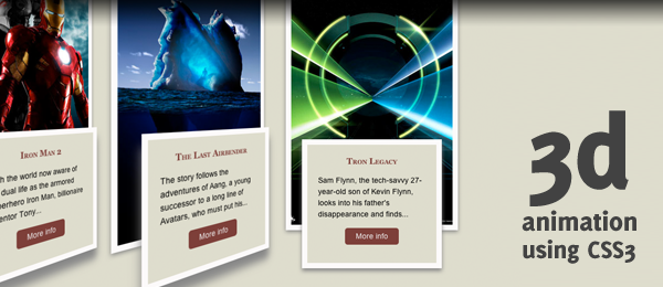
Simply open up the demo page and hover the movie poster elements and be amazed. As you could have expect, this technique will only work on -webkit based browsers (Latest version of Safari and probably Chrome too). Even Safari on the iPhone displays the 3d effect, but not the animations.
For those who don’t have a webkit browser, I’ve added a small video to this post to see the demo in action. This really opens up the possibilities and shows the strength of CSS3!
Video
Here’s a small video example, where the page is running on the latest version of Safari.
Looks pretty nifty, doesn’t it? Now let’s see how we can create something like this ourself!
HTML
As usual, we’re using HTML as the backbone for this effect. It will not contain any strange stuff, since all the "magic" will happen in CSS.
<ul id="movieposters">
   <li>
      <img src="images/01_iron_man_2.jpg" alt="Iron Man 2" />
      <div class="movieinfo">
         <h3>Iron Man 2</h3>
         <p>With the world now aware of his dual life as the armored superhero Iron Man, billionaire inventor Tony...</p>
         <a href="#" title="Iron Man 2">More info</a>
      </div>
   </li>
   <!-- More movie posters here -->
</ul>
That’s all we need to create the nifty effect! Feel free to add more movie posters (and info) to the list, and you’re ready to go.
CSS
Here’s the CSS I came up with. Make sure you read the comments that I added, so you’ll understand what the code does.
/* Basic list things. */
#movieposters
   { list-style:none; margin:100px 0; height:550px; }

/* List items. Take note of the -perspective property. We assign the transform-style to
* make the info element tranform correctly with the parent. transition is used for animation
*/
#movieposters li
   { display:inline; float:left;
   -webkit-perspective: 500; -webkit-transform-style: preserve-3d;
   -webkit-transition-property: perspective; -webkit-transition-duration: 0.5s; }

/* When hovering, we change the perspective. Since this property is defined
* in the transition, it'll animate occordingly.
*/
#movieposters li:hover
   { -webkit-perspective: 5000; }

/* We use the tranform property to enhance the 3d effect, making it rotated.
* We also add some shadows here, just to add even more depth.
* Also, for the image, we capture the rotateY event to be animated (transition)
* /
#movieposters li img
   { border:10px solid #fcfafa; -webkit-transform: rotateY(30deg);
   -moz-box-shadow:0 3px 10px #888; -webkit-box-shadow:0 3px 10px #888;
   -webkit-transition-property: transform; -webkit-transition-duration: 0.5s; }

/* Rotate back when hovering the parent element */
#movieposters li:hover img
   { -webkit-transform: rotateY(0deg); }

/* For the movie info box, we do almost the same as for the image. Still, we use
* some extra css (like the position, margin etc.) to place it on the correct place.
* Take note of the translateZ and rotateY properties to enhance the 3d effect.
*/
.movieinfo { border:10px solid #fcfafa; padding:20px; width:200px; height:180px; background-color:#deddcd; margin:-195px 0 0 55px; position:absolute;
   -moz-box-shadow:0 20px 40px #888; -webkit-box-shadow:0 20px 40px #888;
   -webkit-transform: translateZ(30px) rotateY(30deg);
   -webkit-transition-property: transform, box-shadow, margin; -webkit-transition-duration: 0.5s; }

/* Animate everything to their 2d state when hovering the parent. */
#movieposters li:hover .movieinfo
   { -webkit-transform: rotateY(0deg); -webkit-box-shadow:0 5px 10px #888; margin:-175px 0 0 30px; }

/* Some basic CSS for the movie info */
.movieinfo h3 { color:#7a3f3a; font-variant: small-caps; font-family:Georgia,serif,Times; text-align:center; padding-bottom:15px; }
.movieinfo p { padding-bottom:15px; }
.movieinfo a { background-color:#7a3f3a; padding:5px 10px; color:#eee; text-decoration:none; display:block; width:80px; text-align:center; margin:0 auto;
   -moz-border-radius:5px; -webkit-border-radius:5px; }
.movieinfo a:hover, .movieinfo a:focus { background-color:#6a191f; color:#fff; }
That’s all the code we need to create this beautiful effect!
Oddities
Although this effect looks pretty great already, I found some minor bugs/oddities:
- Sometimes, when you hover the poster, it doesn’t trigger the
:hoverevent, preventing the animation to occur. - For some reason, when animating the last element (the Tron Legacy Poster), the info box is quickly flickering just before the animation ends.
If you know why these oddities occur (is it my CSS or a real bug in -webkit), feel free to share your knowledge.
Conclusion and Download
Other than those rather small oddities, I’m pretty happy with the final result. Although the one Malarkey created might be a little bit smoother, mine looks like it could be used in your next web project too (if you’re have clients that work on CSS3 ready browser).
What do you think? Where could you see this kind of CSS in action? Do you want to see more of these demos? Feel free to share!