Placed in: Home arrow Programming arrow CSS arrow Animated wicked CSS3 3d bar chart
Animated wicked CSS3 3d bar chart

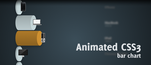
Do you remember the Wicked CSS3 3d bar chart that I placed online a couple of weeks ago? Paul Irish left a comment, requesting for an example with transitions. My reply was that I was already working on that, and today I'm proud to release the animated wicked CSS3 3d bar chart.

The principle is the same as the previous version: Create a beautiful 3d bar chart. But this time, we don't create a "stacked" one (since animation would be hard), but several bars placed under each other. When hovering, the animation shows and the bar will grow to the appropriate size.

Animated wicked CSS3 3d bar chart

One of the neatest things of this example (in my opinion), is that it uses the exact same HTML (except for the title) as the original article (wicked CSS3 3d bar chart). It's a great example to show what you can do with flexible CSS; You can create a totally different page with the same HTML and using only a different style sheet file.

Demo Animated wicked CSS3 3d bar chart   Download Animated wicked CSS3 3d bar chart

Take note that this example only works in -webkit based browsers (Safari and Chrome), because those are the browsers that currently only support CSS3 animation (The next version of Firefox will support animations too). So, once again, this example is just a sneak peak into some awesome stuff CSS3 can do for us.

Video

Here's an example of the page showed in Safari (4.0). It shows all the effects as they should should (rounded corners, gradients, shadow, rgba etc.), but most importantly: The animations.

I guess I warmed you up on how you could create something like this yourself, haven't I? Let's take a look under the hood.

HTML

Like I said, we're going to use the exact same same HTML structure as with the wicked CSS3 3d bar chart.

 
<ul id="bar">
   <li id="iphone">
      <div class="top">
         <img src="images/iphone.png" alt="iPhone" />
      </div>
      <div class="bottom">
         <div class="infobox">
            <h3>iPhone</h3>
            <p>80,1</p>
         </div>
      </div>
   </li>
   <!-- More bar chart items -->
</ul>

As you can see, we're simply using an unordered list that contains several items (the bars). Each bar contains from two segments: The Top and the Bottom. We'll use the magic of CSS to style the top (which also contains the image) to an ellipse (top of the bar). The bottom (the bar body), that contains the info of the bar, will be styled to have a pretty rounded border too.

Now on to the more interesting stuff: The CSS(3) we need in order to create this neat effect.

CSS

The .top and .bottom classes are almost identical to the previous version (check out that tutorial to see how those were created). The only difference is that we now need to rotate the ellipse, since the bars are rotated too. Check out the most important changes:

 
#bar li div.top { float:left; margin-left:10px;
   width:40px; height:100px; -moz-border-radius: 40px/100px; -webkit-border-radius: 40px 100px; border-radius: 40px/100px;
   -webkit-transition-property: margin-left;
   -webkit-transition-duration: 500ms;
}
 
#bar li div.bottom { width:50px;
   height:100px; -moz-border-radius: 40px/100px; -webkit-border-radius: 40px 100px; border-radius: 40px/100px;
   -webkit-transition-property: width;
   -webkit-transition-duration: 500ms;
}

The .top class has a transition-property set to margin-left, since it'll need to move to the right when hovering. The .bottom class has a transition-property set to width, since it needs to expand/grow when hovering. The duration is both set to 500ms, but that can easily be changed.

Now we need to specify the new values for each product individually. Here's an example for the iPhone:

 
#iphone:hover div.top {
   margin-left:160px;
}
 
#iphone:hover div.bottom {
   width:200px;
}

Because the transition-property have been set to act to the specified properties, the animation works as expected. The .top will move to the right, and the .bottom will expand/grown in width. Because of this syntax, other browsers like Firefox will show the expansion too, but without the animation.

This is actually the most important change when compared to the previous version. Yet, there's one neat animation in the text (.infobox) that I would like to show too.

 
#bar li div.bottom div.infobox {
   -webkit-transition-property: color;
   -webkit-transition-duration: 500ms;
}
 
#bar li:hover div.bottom div.infobox {
   color:#eee;
}
 
#bar li div.bottom div.infobox p {
   opacity: 0;
   -webkit-transition-property: opacity;
   -webkit-transition-duration: 500ms;
}
 
#bar li:hover div.bottom div.infobox p {
   opacity:1;
}

The .infobox has a title and a paragraph with a number. The infobox will slowly fade to another font color, and the paragraph with a number will slowly fade in by changing the opacity from 0 to 1. These are the small things that give the design that little bit extra.

Those were the most important changes compared to the wicked CSS3 3d bar chart. Check out the CSS in the example/download to see the full CSS.

Conclusion and Download

Just like with the previous example, this one only works in certain browsers. Yet, it's a pretty cool example to see what CSS3 (animations) can do. Just for the record, Yes, you can create this effect using jQuery too. Yet, I wanted to keep this a full CSS solution, so that's why I used the transition for this effect.

Demo Animated wicked CSS3 3d bar chart   Download Animated wicked CSS3 3d bar chart

What do you think of this technique? What else would you like to see in this CSS? Feel free to share your thoughts!


Tags:  animation css3 bar chart 3d

Interested in this topic? You might enjoy another article I've written called

Did you like this article? Subscribe to my feed or email to keep updated on new articles.

Spread the word and submit to:
Digg!Reddit!Del.icio.us!Facebook!Technorati!StumbleUpon!Newsvine!Furl!Ma.gnolia!
Comments
Add NewSearchRSS
Webstandard-Blog   2010-06-07 09:48:05
Gravatar image Very nice idea and I think (hope) this kind of charts will be the future.
Martin   2010-06-07 10:04:28
Gravatar image Cool concept! I was also thinking of making an Apple-inspired tutorial this week, but guess it will have to wait ;)
Dainis Graveris   2010-06-08 15:57:19
Gravatar image Hehe, man! This is sick tutorial, I didn't know this is even possible! Mad skillzz ! :)
sbuster - I ike   2010-06-08 17:17:21
Gravatar image Nice tutorial
Rad   2010-06-09 12:39:18
Gravatar image You use :hover, it won't work on iPad. Sorry.
Marco - True   2010-06-09 17:20:34
Gravatar image Yup; for it to work on the iPad, you'll need some JavaScript to make it to work as well. Still hope you liked the script!
Rilwis - Love it   2010-06-09 12:40:07
Gravatar image Very creative way of using CSS3. I love the bar :). Thanks for sharing.
LD - Useless   2010-06-09 12:40:44
Gravatar image Completely useless!

The purpose of bar charts is to compare the size of the bars. But with this you can only see 1 bar at a time.
Superdopey - Nice!   2010-06-09 13:01:15
Gravatar image Nicely done.

To the guy above me: the purpose of this demo is to show how you can make a nice graph using CSS3.

Besides the source is available, so you can change it to the behaviour you want.
Marco - Exactly   2010-06-09 17:19:18
Gravatar image Exactly Superdopey, you totally understand! The previous example has no animation and is probably more useful, but this one is just a great example on what CSS3 can do ;) .
Beben - Prodigy of Head   2010-06-09 14:22:56
Gravatar image its a cool B)
Marco - Thanks!   2010-06-09 17:18:30
Gravatar image @Webstandard-Blog, @Martin, @Dainis, @sbuster, @Rilwis, @Beben
Thanks a lot for those kind words, really appreciate it! I'm glad you like this example :) .
Daniel Knell   2010-06-10 06:42:05
Gravatar image Would the animation not had better served as an initial effect, resizing the bars to their required size?

At the moment it kind of ruins the usability of the chart, as you can no longer compare the values visually when you can only see one at a time that's not possible.

The bells and whistles CSS3 brings should be used to enrich the experience not detract from it.
udaipur hotels - udaipur hotels   2010-06-10 16:32:29
Gravatar image thanks for sharing of information with us. It's really great article
Rajnish   2010-06-10 21:41:27
Gravatar image Hey, Thanks for sharing this. I would like to tell you, This is extremely wonderful and I really liked it.
I always like to read on these topics and one of the best thing is that,
I am looking for this from a long time. Thank you for this again.

Rajnish Kumar
cyb   2010-06-10 22:07:09
Gravatar image Very interesting. This will help me alot!
Charon - Excellent   2010-06-11 08:24:48
Gravatar image Very nice post. I like your image you use. It is nice to see someone confident enough to use their own sites to help others. Thanks again for sharing
tee are   2010-06-22 13:23:26
Gravatar image thanks for the sharing.. i'm newbie in css so this will be a great help for me
Fedor Indutny - User-select   2010-06-25 08:43:18
Gravatar image Why you're not using "-webkit-user-select: none" in your examples?
Mickey - Lovely   2010-07-06 09:08:54
Gravatar image Its great :lol:
soimon   2010-07-19 14:28:11
Gravatar image Nice experiment :D
I really like the new features in CSS3, but I think some of them are a little far-fetched. Animation is great, but that's where javascript is made for in my opinion. I like ways to finally reduce the amount of slicing you have to do to make a simple box with round corners, but I don't want a "loginanddisplayusername: true;" properties to exist :P

I would also like them to get rid of the webkit- and -moz pre and suffixes...
Adam Cooper - I love hacking on CSS.   2010-07-24 22:32:22
Gravatar image Great details here. I love hacking on CSS.
Julian   2010-09-02 21:02:59
Gravatar image Is it possible to animate the bars to the left?
Read more...
Name:
Email:
  Gravatar enabled.
Website:
Title:
UBBCode:
[b] [i] [u] [url] [quote] [code] [img] 
 
 
:angry::0:confused::cheer:B):evil::silly::dry::lol::kiss::D:pinch:
:(:shock::X:side::):P:unsure::woohoo::huh::whistle:;):s
:!::?::idea::arrow:
 
Security Image
Please input the anti-spam code that you can read in the image.
Unsubscribe from e-mail notifications.
 
Next >
Subscribe

5407 people are subscribed for free to receive high quality articles.