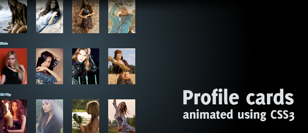
Whoah, been a while since I’ve posted something! Yet, I wanted to mess around with some fun CSS3 stuff and wanted to share the results with you. Today, we’re going to create CSS animated profile cards. Although there are four different kind or animations (Push, Slide, 3D Flip and Explode), they all share the same kind of HTML structure. Simply hover over the images to see the contact details.
The pictures used are created by Belovodchenko Anton, but their profile data is fake. -prefix-free has been used to remove the vendor prefixes in CSS. All animations are done with the help of the transition property.
So, how can you create this effect for yourself? Let’s dive into the code, explaining the parts one at the time.
General HTML and CSS
Like I’ve said before, all the effects on the demo page share the same HTML structure. It’s a simple list that contains all the data, and this is what it looks like.

<ul id="[EFFECT]" class="profiles">
    <li>
        <img class="pic" src="images/[PIC].jpg" />
        <ul class="info">
            <li><a href="[URL]">[NAME]</a></li>
            <li>[MAIL]</li>
            <li>[PHONE]</li>
        </ul>
    </li>
    <!-- More cards -->
</ul>
Take note of the [EFFECT] ID that is used at top level. This way, we can make several different effects simply by using another ID. This is a key part of the shared code. Now to dive into the CSS. I’ve stripped out all the non-important stuff (font-size, width etc.) and stripped it to the bare minimum:
.profiles {
    list-style:none;
}
.profiles > li {
    float:left;
}
.info, .pic {
    /* Make the picture and info go "on top" of each other */
    position:absolute;
}
.info {
    /* Hide the info by default */
    opacity:0;
}

That’s about it! For the full CSS and HTML, simply dive into the source code. Now, we can go on with the effects.
Push

#push .info {
    transition: all 0.3s;
    transition-delay:0.2s;
}
#push .pic {
    transition: all 0.5s;
}
/* We fade in the info */
#push li:hover .info {
    opacity:1;
}
/* We make the opacity lower, rotate and scale the picture */
#push li:hover .pic {
    opacity:0.7;
    transform: scale(0.7) rotate(10deg);
}
Slide
/* In the default state, the info box has been slightly moved to the left */
#slide .info {
    transition: all 0.3s;
    transform: translate(-50px, 0);
}
#slide .pic {
    transition: all 0.3s;
}
/* In the hover state, the info box has been moved to the original position and faded in */
#slide li:hover .info {
    opacity:1;
    transform: translate(0, 0);
}
/* In the hover state, the picture has been moved to the right and is faded out */
#slide li:hover .pic {
    opacity:0;
    transform: translate(50px, 0);
}
3D Flip
#flip {
    perspective: 800px;
}
/* By default already visible */
#flip .info {
    transition: all 0.8s;
    opacity:1;
    transform-style: preserve-3d;
}
/* Flip the text: Will be flipped back when animated */
#flip .info li {
    transform: rotateY(180deg);
}
#flip .pic {
    transition: all 0.8s;
    backface-visibility: hidden;
    z-index:999;
    transform-style: preserve-3d;
}
/* Simply rotate when hovering */
#flip li:hover .info {
    transform: rotateY(180deg);
}
/* Simply rotate when hovering */
#flip li:hover .pic {
    transform: rotateY(180deg);
}
Explode
/* By default, the info is smaller */
#explode .info {
    transition: all 0.7s;
    transform: scale(0.8);
}
#explode .pic {
    transition: all 0.7s;
}
/* On hover, fade in and show original size */
#explode li:hover .info {
    opacity:1;
    transform: scale(1);
}
/* On hover, fade out and grow */
#explode li:hover .pic {
    opacity:0;
    transform: scale(1.4);
}
Conclusion & Download
There you have it: four different kind of hover effects animated using CSS for profile cards. Grab the code to learn even more, make adjustments or improve it.
What do you think? Any of the effects that you prefer? Or maybe even an effect that you would like to share based on the same HTML? I would love to see that!