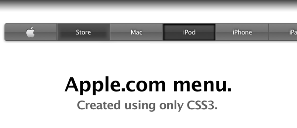
A while ago (I think it was around the release of the iPad), the Apple.com website got a new navigation menu on the top of the page. This menu bar was a lot darker than the previous, grey version, but looks just as great. One thing which I noticed about the navigation, is that the buttons are created out of images. That’s the moment I thought we could do better, using some nifty CSS3 techniques. So today, I present you the Apple.com navigation menu created using only CSS3.
Since this demo heavily relies on CSS3, make sure you view it using a CSS3 compatible browser. The Webkit browsers (Safari and Chrome) display the effect the best, followed by the latest version of Firefox. Opera and IE don’t display everything correct, but the menu seems to be working.
The menu on the Apple.com website also updated their search suggestion, which hasn’t been implemented in this demo (yet), but I might create that later. For now, let’s check out all the CSS3 you’ll need to be able to create this fancy looking navigation menu.
Techniques
Before I’ll let you dive into the CSS part of this technique, I want to point out a couple of techniques that are used in order to create the desired effect:
font– The same font from Apple has been used (with fallback for those computers where the font isn’t installed), and is calledLucida.text-shadow– A smooth text shadow is applied to the text placed on the buttons.border-radius– The border radius is needed to create the rounded border on the first and last menu item, but also in the search bar.box-shadow– This type of shadow is used in several places to create a subtle drop shadow effect.box-shadow: inset– By using theinsetproperty of a box shadow, we can create an inner shadow effect.gradient– Gradients are used a lot on the demo page. Sadly, Webkit (Chrome and Safari) have a different syntax than Firefox. Luckily, this CSS3 Gradient Generator helped me out.:first-child– This pseudo selector is used to only give the first item the rounded cornes.:not(:last-child)– The:notselector filters the last child to act to hover events, since we don’t need them there (it’s the search bar).background-image: url(), gradient()– Multiple backgrounds are applied to the search field, to show the magnifier and the gradient background.keyframes– A nifty animation has been applied using keyframes to fade in the menu bar (the same kind of effect was used when the iPad was displayed on the front page of Apple.com). Take note this only works in Webkit browsers (Chrome and Safari).- Fallback – Fallbacks are pretty important for browsers that don’t support the effect completely. I’ve used a solid
background-colorwhen the gradient wasn’t support.
As you can see, a lot of CSS3 has been used here. Also, the high level of detail in the menu makes it look very pretty. Let’s see how the final CSS looks like!
CSS
I’ve added comments to some parts to explain what it does.
/* APPLE STYLE NAVIGATION MENU */
#appleNav {
    margin:40px 0; list-style:none;

    /* Lucinda Grande is the font used on the website from Apple. */
    font-family: "Lucida Sans Unicode", "Lucida Grande", Verdana, Arial, Helvetica, sans-serif; letter-spacing:-0.5px; font-size:13px;

    /* Apply a subtle text-shadow to the text */
    text-shadow: 0 -1px 3px #202020;

    /* We want to add the shadow to the complete navigation menu. In order to do that, we'll need to set
    the correct width and height, and also the correct borders, in order to create the perfect drop shadow */
    width:980px; height:34px;

    -moz-border-radius:4px;
    -webkit-border-radius:4px;
    border-radius:4px;

    -moz-box-shadow: 0px 3px 3px #cecece;
    -webkit-box-shadow: 0px 3px 3px #cecece;
    box-shadow: 0 3px 4px #8b8b8b;
}

#appleNav li {
    display:block; float:left; border-right:1px solid #5d5d5d; border-left:1px solid #929292; width:105px; height:34px; border-bottom:1px solid #575757; border-top:1px solid #797979;

    /* Gradient backgrounds for the buttons. Generated using http://gradients.glrzad.com/ */
    background-image: -webkit-gradient(linear, left bottom, left top, color-stop(0, #787878), color-stop(0.5, #5E5E5E), color-stop(0.51, #707070), color-stop(1, #838383));
    background-image: -moz-linear-gradient(center bottom, #787878 0%, #5E5E5E 50%, #707070 51%, #838383 100%);
    background-color:#5f5f5f; /* Fallback */
}

/* Set the states when hovering, except for the last item in the list (the search bar), since it doesn't need to change */
#appleNav li:not(:last-child):hover {
    background-image: -webkit-gradient(linear, left bottom, left top, color-stop(0, #3F3F3F), color-stop(0.5, #383838), color-stop(0.51, #434343), color-stop(1, #555555));
    background-image: -moz-linear-gradient(center bottom, #3F3F3F 0%, #383838 50%, #434343 51%, #555555 100% );
    background-color:#383838; /* Fallback */

    /* We use the inset of the box shadow to create a subtle inner glow when hovering */
    -moz-box-shadow: inset 0 0 5px 5px #535353;
    -webkit-box-shadow: inset 0 0 5px 5px #535353;
    box-shadow: inset 0 0 5px 5px #535353;
}

/* When the user clicks the button, we simply change the box inset (compared to the "hover") */
#appleNav li:not(:last-child):active {
    background-image: -webkit-gradient(linear, left bottom, left top, color-stop(0, #3F3F3F), color-stop(0.5, #383838), color-stop(0.51, #434343), color-stop(1, #555555));
    background-image: -moz-linear-gradient(center bottom, #3F3F3F 0%, #383838 50%, #434343 51%, #555555 100% );
    background-color:#383838; /* Fallback */

    -moz-box-shadow: inset 0 1px 2px 2px #000;
    -webkit-box-shadow: inset 0 1px 2px 2px #000;
    box-shadow: inset 0 1px 2px 2px #000;
}

#appleNav li a {
    color:white; text-decoration:none; text-align:center; display:block; line-height:34px; outline:none; }

/* Styling of the search field */
#appleNav form input {
    width:76px; height:20px; margin-left:9px; margin-top:8px; border:none; padding-left:20px; padding-right:10px; color:#eee;

    -moz-border-radius:10px;
    -webkit-border-radius:10px;
    border-radius:10px;

    /* We use the CSS3 multiple backgrounds for the input field: The magnifier image and the gradient background */
    background-image: url("../images/magnifier.png"), -webkit-gradient(linear, left bottom, left top, color-stop(0, #747474), color-stop(0.5, #6E6E6E), color-stop(0.51, #7E7E7E), color-stop(1, #8D8D8D));
    background-image: url("../images/magnifier.png"), -moz-linear-gradient(center bottom, #747474 0%, #6E6E6E 50%, #7E7E7E 51%, #8D8D8D 100%);
    background-repeat: no-repeat;

    background-color:#6E6E6E; /* Fallback */

    -moz-box-shadow: inset 0 2px 1px 1px #363636;
    -webkit-box-shadow: inset 0 2px 1px 1px #363636;
    box-shadow: inset 0 2px 1px 1px #363636;
}

/* Rounded corner for the first in last item. Shorthand: Top left, Top right, Bottom right, Bottom left.
We also remove the borders, since they don't need them. */
#appleNav li:first-child {
    -moz-border-radius:4px 0 0 4px;
    -webkit-border-radius:4px 0 0 4px;
    border-radius:4px 0 0 4px;

    border-left:none;
}

/* The first child image - the logo - has to be centered. Because of the image dimensions, we manually need to shift it a bit. */
#appleNav li:first-child a img {
   vertical-align:middle; margin-top:-2px;
}

#appleNav li:last-child {
    -moz-border-radius:0 4px 4px 0;
    -webkit-border-radius:0 4px 4px 0;
    border-radius:0 4px 4px 0;

    border-right:none;

    /* The width of the last menu item (search bar) is bigger than the others */
    width:124px;
}

/* Fade in animation (Webkit only) */
@-webkit-keyframes showMenu {
    from { opacity: 0; top:-20px; }
    to   { opacity: 1; }
}

#appleNav {
     -webkit-animation: showMenu 1s; position:relative;
}

Conclusion
That’s about it, everything you need to create a fully CSS3 powered Apple.com-style navigation menu! What do you think of it?
Did you learn anything from the script? Do you see any room for improvement? Feel free to share!
