Placed in: Home  Art Inspiration Evolution of the Eurovision Song Contest Logo 1956-2010 comprar viagra en españa
comprar viagra online
comprar viagra generico barato
comprar cialis generico online
comprar cialis online seguro
comprar viagra online
comprar viagra generico barato
comprar cialis generico online
comprar cialis online seguro
| Evolution of the Eurovision Song Contest Logo 1956-2010 |
|
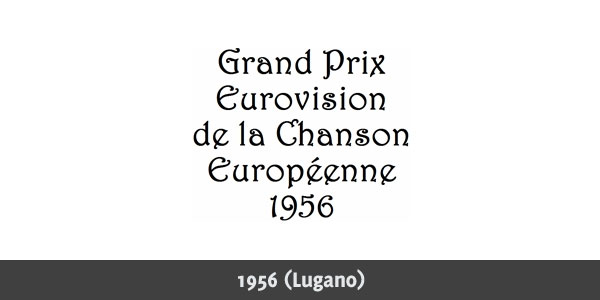
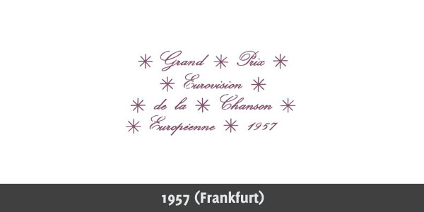
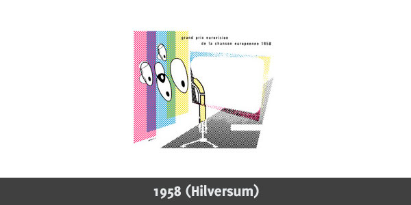
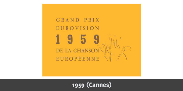
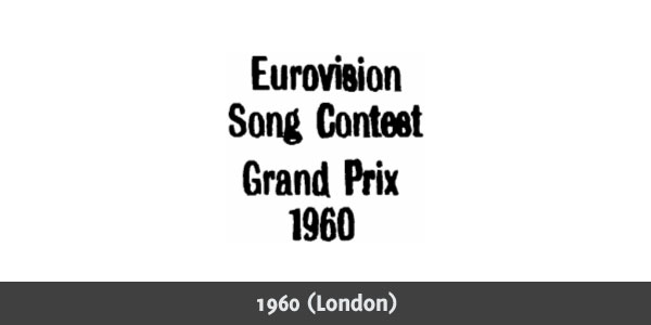
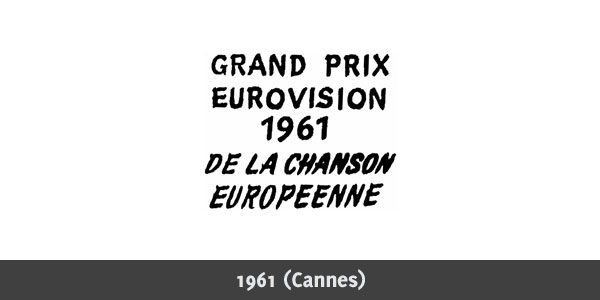
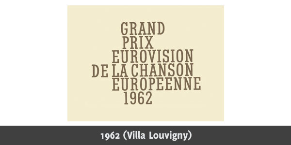
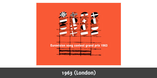
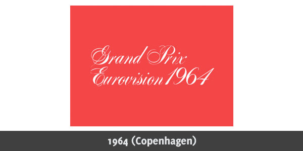
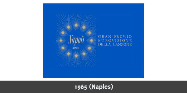
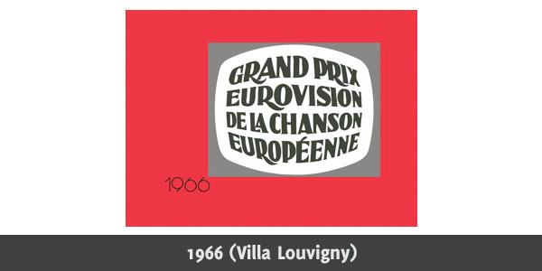
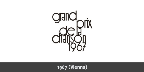
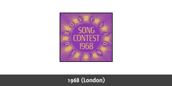
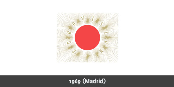
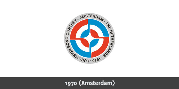
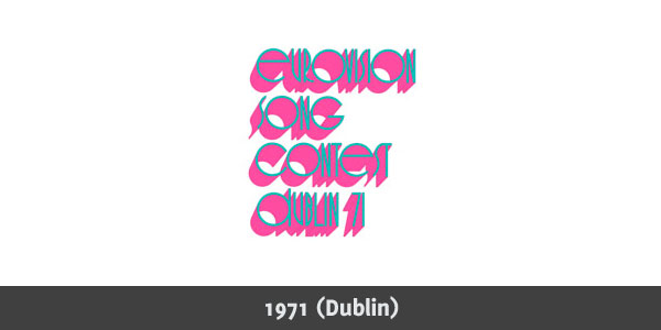
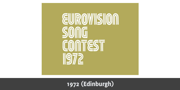
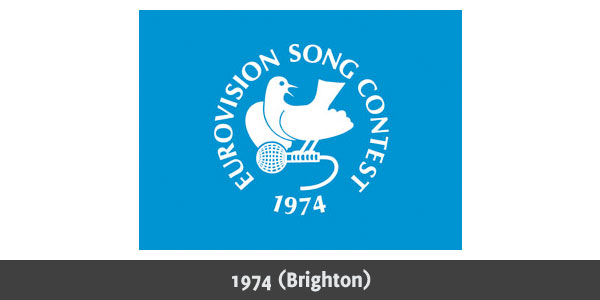
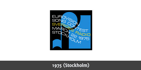
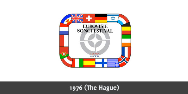
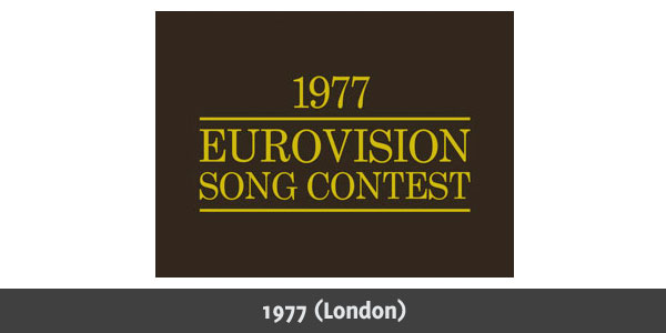
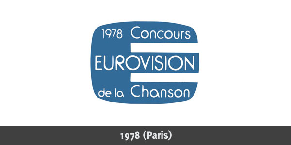
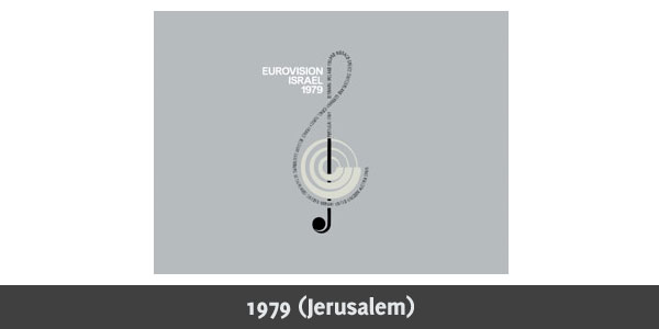
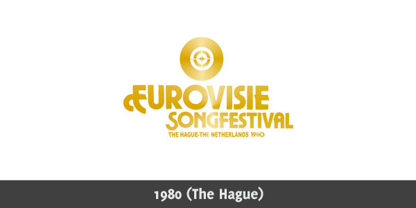
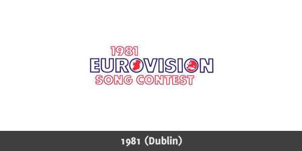
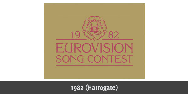
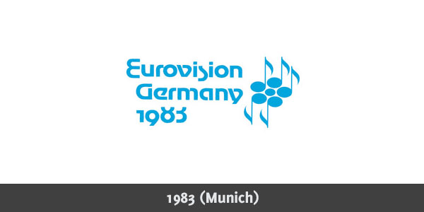
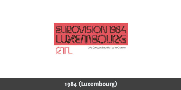
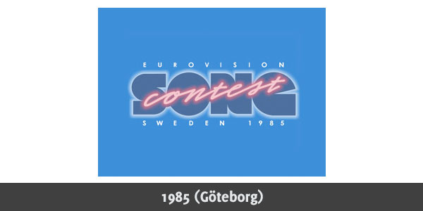
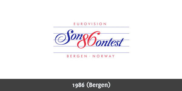
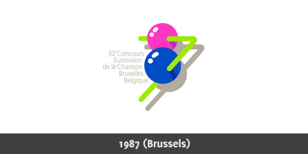
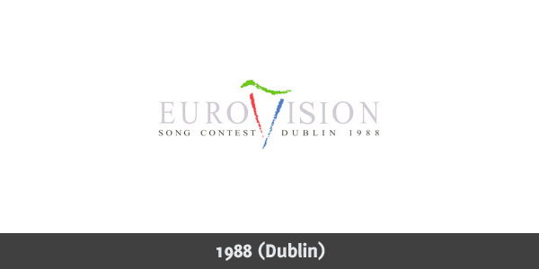
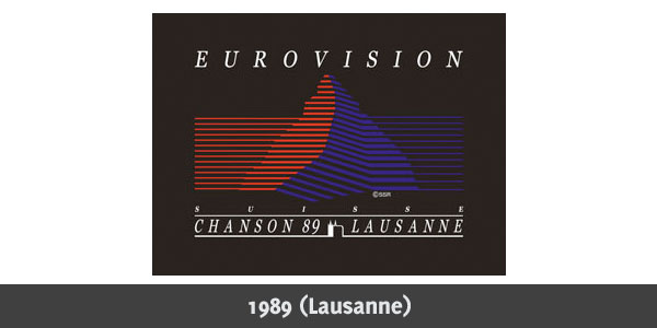
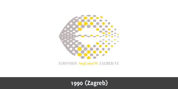
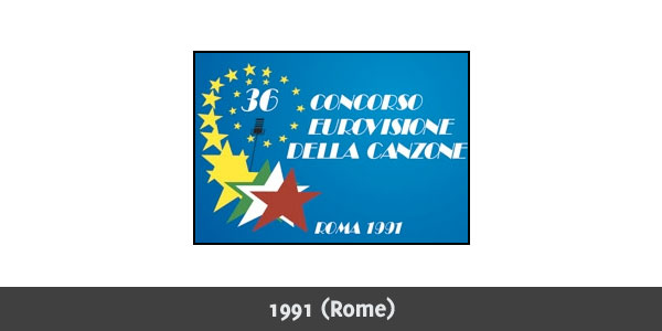
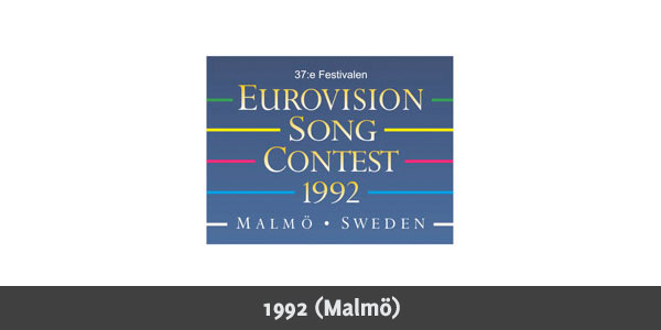
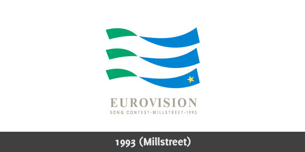
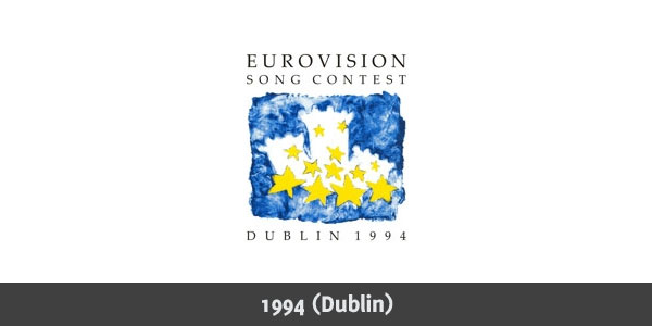
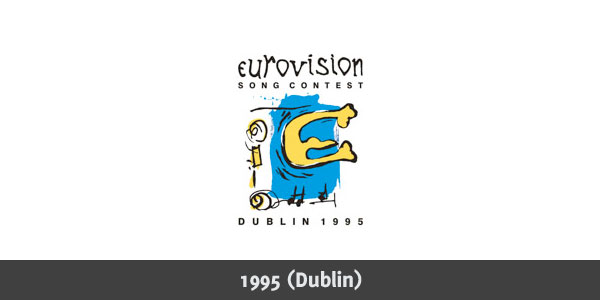
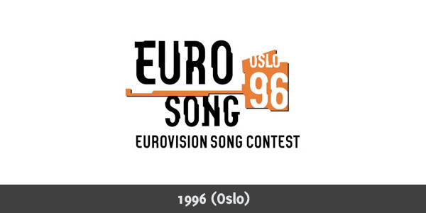
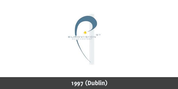
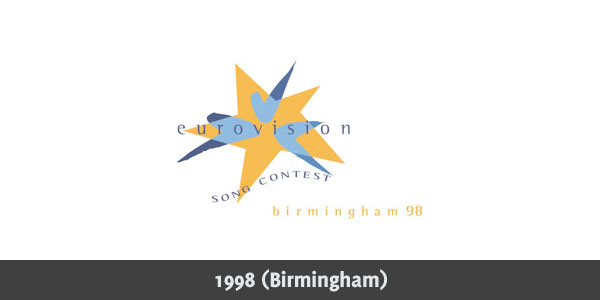
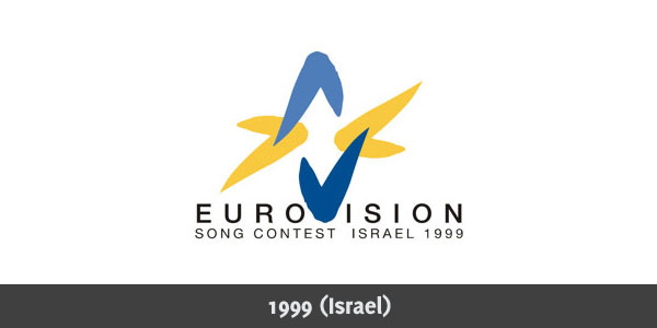
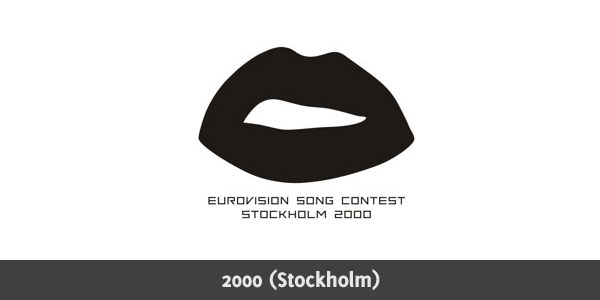
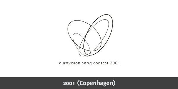
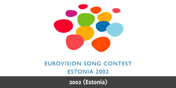
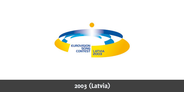
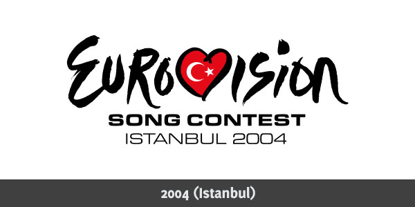
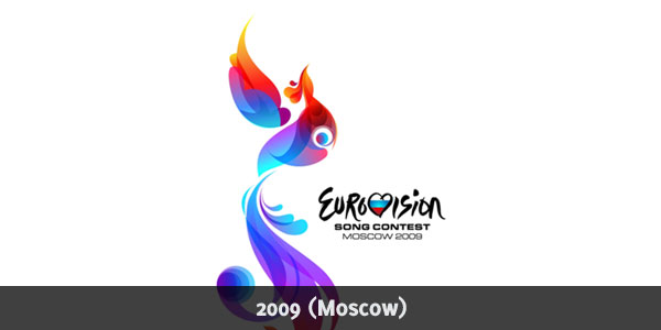
Past weekend, Norway won the 54th edition of the Eurovision Song Contest. Iceland got the second place and Azerbaijan got away third. I personally didn't really follow much of the contest since The Netherlands didn't even make it into the finals. One thing that I really loved about the contest was their logo. The colourful bird (based upon a "Fantasy Bird") is a real sleek sub-logo next to the generic logo. While checking the logos from the previous years, I came across some very well designed logos for this contest. This article is a roundup showing the evolution of the Eurovision Song Contest logo from 1956 (when the first contest was held) until now. Some logo's (especially in the early days) are nothing more than simple text. Later on, the logo became more complex, while some find their beauty in simplicity. 
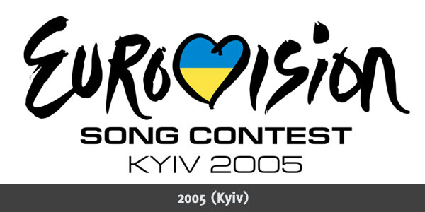
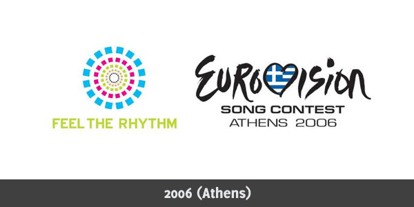
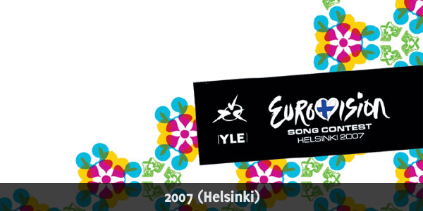
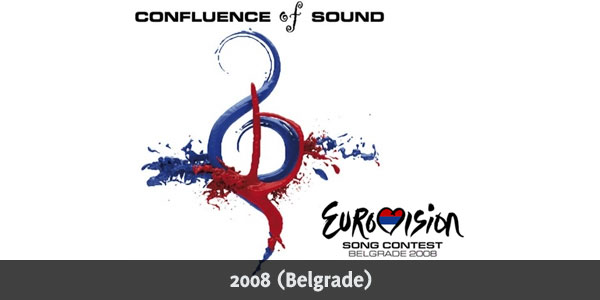
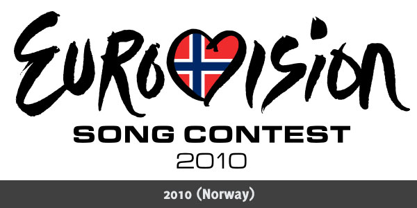
The generic logo was introduced in 2004 to create a consistent visual identity. The host country's flag appears in the heart. The logo from 2010 listed here is only the main logo: A sub-logo is not yet created. While looking at these amazing logos, you might see that the logo from 1973 is missing. EurovisionCovers and Wikipedia both show different (low quality) versions from that year. Now make sure to check out this amazing inspirational logo collection showing some great Eurovision Song Contest logos over the past years. Eurovision Song Contest Logo 1956-2010
Which one did you like the most? Or are there more that you really liked? And how do you think the real logo for 2010 will look like? Please share! Tags: eurovision song contest logo inspiration collection music Interested in this topic? You might enjoy another article I've written called |


| < Prev | Next > |
|---|
| Search |
|---|
| Or try the sitemap |
Friends of Marcofolio.net
 2007 - 2018 Marcofolio.net
This (we)blog brings you information about (web)design, blogging tips, (programming) tutorials and much, much more. I can't describe Marcofolio.net in words: Just look around and be amazed. Many (new) visitors have a habit to stick around, just because of the variety of articles.
Have fun reading this blog and don't forget to subscribe to the feed to keep updated on the latest articles.