Placed in: Home arrow Programming arrow CSS arrow CSS3 animations and their jQuery equivalents
CSS3 animations and their jQuery equivalents

As you might know already, I'm not a big fan of animations that are added in CSS3. Yet, several people on Twitter told me why they really like the feature. At that point, I wanted to play around with it too.

At the same time, I wanted to see if those animations with CSS3 could be created with jQuery too (especially for those browser that don't support CSS3 animations yet). So today, I present you Five examples of CSS3 animations and their jQuery equivalents.

CSS3 animations and their jQuery equivalents

This tutorial/these examples will show the use of the same HTML, with different classes for CSS3 and jQuery. You can compare both the codes and see which one you like more. Don't forget to check the demo/download the source code to view how everything is working under the hood.

Demo CSS3 animations and their jQuery equivalents   Download CSS3 animations and their jQuery equivalents

IMPORTANT NOTE:
Sadly, CSS3 and HTML5 aren't the standards (yet) these days (when will it ever be?). Since this demo is using CSS3 animations, not all (modern) browsers will be able to show off the full effects. Because of this, it only works on Apples Safari and Google Chrome as they are the only browsers supporting the CSS3 animations via the -webkit- prefix. So, for now, this is just for fun and learning more about CSS3 and jQuery. The jQuery effects will work on other browsers though.

With that said, check out how you can re-create these and learn some more about CSS3 animations and jQuery.

Video

Here's a small example video showing both the CSS3 and jQuery animations inside the latest version of Safari.

Of course, if you're running Safari or Chrome, you can view all examples yourself.

Fade

CSS3 and jQuery Animations - Fade

For our first effect, we'll do a simple fade. When hovering an element, it fades to a given opacity. Let's see how you can create this effect using both CSS3 and jQuery.

HTML

<img src="images/fadeimg.png" alt="Fade Image" class="css3_fadeimg" />

As you can see, I'm simply using an image which has class applied. As you can imagine, you can apply this class to other elements.

CSS3

 
@-webkit-keyframes fade {
   0% {
      opacity: 1.0;
   }
   100% {
      opacity: 0.5;
   }
}
 
.css3_fadeimg:hover {
   -webkit-animation-name: fade;
   -webkit-animation-duration: 1s;
}

With the animation-name and animation-duration, we can set the effect. Using the keyframes (and the name of the effect), we can tell the element how to act. Set the 0% and 100% properties, and the browser will calculate how to animate the effects. Great and easy!

jQuery

 
$(".jquery_fadeimg").hover(function() {
   $(this).stop().animate({ opacity: 0.5 }, 1000, function() {
      $(this).stop().animate({ opacity: 1.0 }, 0);
   });
}, function() {
   $(this).stop().animate({ opacity: 1.0 }, 0);
});

The jQuery example is just as elegant as the CSS3 one. Simply apply an hover event to the element and animate it over a given timespan.

Bounce

CSS3 and jQuery Animations - Bounce

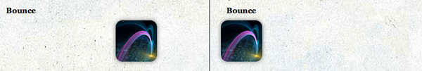
Now that we know how to create a simple fade, we'll create an example which is a little bit harder: A bounce effect. We'll apply the effect to an image that'll bounce to the right (and back).

HTML

 
<div class="css3_bounce bounce">
   <img src="images/bounceimg.png" class="bounceimg" />
</div>

As you can see, there is a surrounding container that holds one image. We'll need the container to capture the hover effect, and the image will bounce inside the container.

CSS3

 
@-webkit-keyframes bounce {
   from {
      margin-left: 0px;
   }
   to {
      margin-left: 250px;
   }
}
 
.css3_bounce:hover img {
   -webkit-animation-name: bounce;
   -webkit-animation-duration: 1s;
   -webkit-animation-iteration-count: 2;
   -webkit-animation-direction: alternate;
}

Just like with the previous effect, the name and duration are needed in this effect. By setting the iteration-count to 2, it'll only bounce from left to right, to left and stop. Inside the keyframes, we can use the from and to properties too instead of the percentages.

jQuery

 
$(".jquery_bounce").mouseenter(function(){
   $("img", this).animate({ marginLeft : '250px' } , {
         duration: 1000,
         easing: 'easeOutCubic',
         complete:function() {
            $(this).animate({ marginLeft : '0px' } , {
            duration: 1000,
            easing: 'easeInCubic'});   
         }
      });
}).mouseleave(function() {
   $("img", this).stop().css({ marginLeft : '0px' });
});

With the help of the jQuery Easing Plugin we can recreate this beautiful effect in the exact same way as with CSS3. We'll simply change the marginLeft properties from the CSS (just like with CSS3). That's how you create a bounce!

Pulsate and Colorize

CSS3 and jQuery Animations - Pulsate and Colorize

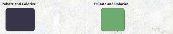
On to the next step, an even more advanced animation. We'll pulsate and colorize a given division. Let's see how to create this effect.

HTML

<div class="css3_pulsate pulsate"></div>

As you can see, just a simply div is what we're going to use for this effect. Check out the other CSS properties (like width, hight and background-color) in the demo/download.

CSS3

 
@-webkit-keyframes pulsate {
  0% { width:100px; }
  5% { width:150px; left:-25px; }
  10% { width:100px; left:0px; }
  15% { width:150px; left:-25px; }
  20% { width:100px; left:0px; }
  
  40% { width:100px; background-color:#38374A; }
  45% { width:150px; left:-25px; background-color:#38374A; }
  50% { width:100px; left:0px; background-color:#38374A; }
  55% { width:150px; left:-25px; background-color:#38374A; }
  60% { width:100px; left:0px; background-color:#38374A; }
 
  80% { width:100px; background-color:#45002D; }
  100% { width:100px; background-color:#45002D; }
}
 
.css3_pulsate:hover {
  -webkit-animation-name: pulsate;
  -webkit-animation-duration: 3s;
  -webkit-animation-timing-function: ease-in-out;
}

I was pretty happy to see that the CSS3 implementation looks very good! By setting a value for each percentage of the animation, we can make it look like a pulsating box. We'll also change the colour of the box.

jQuery

 
$(".jquery_pulsate").hover(function() {
  $(this).stop().animate({ width: '150px', left:'-25px' }, 150, function(){
    $(this).animate({ width: '100px', left:'0px' }, 150, function() {
      $(this).animate({ width: '150px', left:'-25px' }, 150, function() {
        $(this).animate({ width: '100px', left:'0px' }, 150, function() {
          $(this).animate({ backgroundColor: '#38374A' }, 600, function() {
            $(this).animate({ width: '150px', left:'-25px' }, 150, function(){
              $(this).animate({ width: '100px', left:'0px' }, 150, function() {
                $(this).animate({ width: '150px', left:'-25px' }, 150, function() {
                  $(this).animate({ width: '100px', left:'0px' }, 150, function() {
                    $(this).animate({ backgroundColor: '#45002D' }, 600, function() {
                      $(this).animate({ backgroundColor: '#45002D' }, 600, function() {
                        $(this).animate({ width: '100px', backgroundColor: '#6CAB6C' }, 1);
                      });
                    });
                  });
                });
              });
            });
          });
        });
      });
    });
  });
}, function() {
  $(this).stop().animate({ width: '100px', backgroundColor: '#6CAB6C' }, 1);
});

The jQuery equilavent of this effect, isn't as pretty. We'll use the callback to animate each time and make it look like the pulsate. By using the jQuery Color Plugin, we can smoothly animate the background colour. Still, I really prefer the CSS3 animation way on this one.

Link nudge

CSS3 and jQuery Animations - Link Nudge

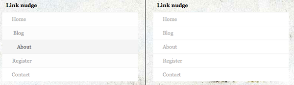
Let's move on to a more practical example - link nudging. I'm doing it at Marcofolio too - simply hover over the elements in the main menu and you'll see the effect. Let's see how you can create this effect with CSS3 animations too!

HTML

 
<div class="css3_nudge nudge">
   <ul>
      <li><a href="#" title="Home">Home</a></li>
      <li><a href="#" title="Blog">Blog</a></li>
      <li><a href="#" title="About">About</a></li>
      <li><a href="#" title="Register">Register</a></li>
      <li><a href="#" title="Contact">Contact</a></li>
   </ul>
</div>

Just a simple unordered list with list items that contains anchor tags (links). How simple can it get? On to the nudge effect.

CSS3

 
.css3_nudge ul li a {
   -webkit-transition-property: color, background-color, padding-left;
   -webkit-transition-duration: 500ms, 500ms, 500ms;
}
         
.css3_nudge ul li a:hover {
   background-color: #efefef;
   color: #333;
   padding-left: 50px;
}

We're going to animate the anchor tags inside the list. By using the transition-property (shorthand version), we can animate more properties at the same time (given a certain duration). In the :hover state, we'll animate those properties. When the hover stops, it automatically changes back to the original state. Pretty clean and simple code.

jQuery

$(".jquery_nudge ul li a").hover(function(){
  $(this).stop().animate({ paddingLeft: '50px', backgroundColor: '#efefef', color : '#333' }, 500);  
}, function() {
  $(this).stop().animate({ paddingLeft: '25px', backgroundColor: '#ffffff', color : '#afafaf' }, 500);
});

The jQuery equivalent is just as elegant. By using the jQuery Color Plugin again, we can also colorize the backgroundColor and color properties with a smooth animation. Nice!

Accordion

CSS3 and jQuery Animations - Accordion

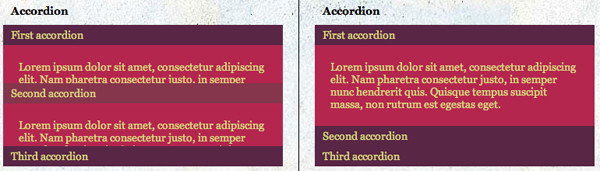
I have to admit - this is a little cheat by using a different HTML code for this effect. This is also the reason why, by default, the accorion (also on the example page) are different. The CSS3 version hasn't expanded, while the jQuery version does. Let's see why.

HTML - CSS3

 
<div class="css3_accordion accordion">
<a href="#firstacc" title="Expand">First accordion</a>
   <div id="firstacc"><p>First content</p></div>
   <a href="#secondacc" title="Expand">Second accordion</a>
   <div id="secondacc"><p>Second content</p></div>
   <a href="#thirdacc" title="Expand">Third accordion</a>
   <div id="thirdacc"><p>Third content</p></div>
</div>

As you can see, the anchor links, have the same text as the ID from the hidden divisions. This means, the links will append a # to the URL, making the div with the same ID active for the CSS3 :target property.

CSS3

 
.css3_accordion div {
  height: 0;
  overflow: hidden;
  -webkit-transition: height 500ms ease; }
.css3_accordion div:target {
  height: 105px;
}

As you can see, once a div is a target, it'll change the height, showing the accordion effect. By default it's hidden (height: 0 and overflow: hidden, but we'll do a transition to show it. Pretty easy, isn't it?

HTML - jQuery

 
<div class="jquery_accordion accordion">
   <a href="#" title="Expand">First accordion</a>
   <div><p>First content</p></div>
   <a href="#" title="Expand">Second accordion</a>
   <div><p>Second content</p></div>
   <a href="#" title="Expand">Third accordion</a>
   <div><p>Third content</p></div>
</div>

The HTML for the jQuery version is slightly different. I needed to remove the ID's which were applied to the CSS3 menu. All other things are the same!

jQuery

 
$(".jquery_accordion").accordion({ header: 'a' });

The jQuery is, as you can see, really really short. But that only is the case, since I'm using the jQuery UI plugin. But this plugin doesn't allow to close the first tab, which is the reason why it's opened by default.

Conclusion and Download

There we go: 5 different CSS3 animations with their jQuery equivalents. CSS3 animation does have it elegancy in it's own way, but jQuery will have to do for now since that one is only cross-browser usable. The downside from the jQuery versions is that it generates loads of data, since you'll need to download jQuery and the needed plugins.

Demo CSS3 animations and their jQuery equivalents   Download CSS3 animations and their jQuery equivalents

What do you think of these examples? Do you hope that animations will be added to the CSS standard soon? On do you prefer the jQuery way? Feel free to share your opinion.


Tags:  CSS3 animations jquery webdevelopment CSS

Interested in this topic? You might enjoy another article I've written called

Did you like this article? Subscribe to my feed or email to keep updated on new articles.

Spread the word and submit to:
Digg!Reddit!Del.icio.us!Facebook!StumbleUpon!
Comments
Add NewSearchRSS
Destiny Islands - Really useful tut!   2009-12-15 02:40:29
Gravatar image wow this is such a useful tutorial, thanks for sharing on your blog! I know good tutorials aren't easy to come by these days, but following this was so easy and it'll be useful on my website
Marco - Thanks!   2009-12-15 07:31:45
Gravatar image Thanks a lot :D ! I really put loads of time and effort creating high quality tutorials/examples like these and I'm really glad you liked it.

Good luck using them!
Alex Crooks - Awesome   2009-12-15 17:44:46
Gravatar image Very useful thank you!

Amazed at how few worked in the latest version of Firefox, doesn't give the best hope/impressions for its widespread use!
Magne Andersson - Firefox already has...   2009-12-30 22:13:07
Gravatar image Firefox already has support for CSS transitions in the 3.7 Alpha (basic CSS animations) and the work on CSS animation will probably start later.
chris   2009-12-15 18:23:33
Gravatar image Really nice! It's powerful that CSS3 with -webkit-. Hope one day all browsers will support those terrific effects :)
Catherine Azzarello   2009-12-15 18:40:26
Gravatar image Beautifully done demo/tutorial! Also, great idea with the side by side comparison.

Thanks!
Marco - Thanks a lot!   2009-12-15 20:37:07
Gravatar image Thanks a lot for those kinds words all - really appreciate it! It stimulates me to create more high quality content ;) .

Glad you enjoyed it!
Josh   2009-12-16 18:25:22
Gravatar image It's really intriguing to see some of these being used in CSS3. The one I especially like it the accordion. While I wouldn't put something like that live on my site right now, it's nice to know that I will be able to replace the jquery accordions with css3 ones at some point, hopefully soon.
BeBeN - ProdiGy Of HEaD   2009-12-16 20:06:52
Gravatar image wow....its a awesome....usefully. Thanks
Arian Xhezairi - Great post.   2009-12-18 15:22:24
Gravatar image This is the world we've been dreaming to live. Amazing comparison and explanation. Very Powerful techniques.
We oughtta hope all browsers soon will improve themselves.
Magne Andersson - I see...   2009-12-30 22:22:18
Gravatar image I see several advantages with CSS Animation instead of jQuery, but that's probably because I'm not familiar with jQuery (I only have basic knowledge of "classic" JavaScript).

1. Native support most often works best, which CSS animation has (With JavaScript you define what to do, with CSS Animation the browser already knows this).

2. The syntax feels to me much simpler than JavaScript, although it's still more advanced than regular CSS.

3. It requires no knowledge of JavaScript, which, if you prefer to code the design, but not the functions, is very useful.

4. This is a heavy one, CSS Animation requires no extra large JavaScript library to be loaded, which increases bandwidth cost and loading speed of the site.

--------------------------

Of course, I'm not "blind" either, I don't say we should kill JavaScript for animation (yet). As long as browsers like IE6-8 is in use, and any other, which hasn't catched up yet, we should use JavaScript for animation. But when CSS Animation gains widespread support, I hope that we'll see more of that and less JavaScript animation.
tom.higgy - Bostin!   2009-12-30 22:29:28
Gravatar image Opera 10.20 seems to fallback nicely on some effects but handled the jQuery ones a bit oddly on pulsate. That aside, I'm looking forward to browser releases in 2010!

I think this can be used now sort of as enhancement, i.e. as people upgrade browsers they get some nice effects. Browser support for CSS3 will come along eventually.
Web Design Medway - Thanks!   2009-12-30 22:30:18
Gravatar image Really interesting post, thank you very, very much!
kakday - thanks   2010-01-13 07:41:39
Gravatar image nice demo css3
markinyan - thanks   2010-03-01 12:03:20
Gravatar image I think css animation is more useful - it's more simple and understandable by browsers
Theo - Thanks   2010-04-12 08:42:51
Gravatar image Great post, very useful. I think at the moment jQuery is the winner ( cross-browser-compatible vs. data size )
oketrik   2010-04-26 11:04:56
Gravatar image Waw it's awesome, i like it
good man..!!! :lol:
Deepak kaletha - thnks   2010-06-17 13:19:09
Gravatar image Great works... thnks
Nine   2010-07-11 15:20:17
Gravatar image The quite good example of use CSS 3, has found on a site of one Russian design of studio! http://emfire.ru/
Juan Carlos del Valle - webkit jquery implementation   2010-08-06 18:42:41
Gravatar image Hello everybody,

For those who are looking for creating dynamic animations through jQuery but want to use the webkit engine, im working in a plugin for doing this. You can always get the generated styles and keyframes for making the transitions static in the css but if you like this project and you feel like you can help here is the github link:

http://github.com/imekinox/webkit-jquery-tweener

And here is a link to a demo:

http://www.imekinox.com/webkit_demo/demo/webkit-test.html
Ben Barnett - Web Developer   2010-09-06 11:22:25
Gravatar image Came across this post a few months ago and found it really helpful. Since then I've been doing more and more projects using CSS3 and found I kept repeating myself when I wanted to use CSS3 animations, but had to write the jQuery equivalent for unsupported browsers.

In case it's of any use, I've written a jQuery plugin that will simply enhance the jquery $.animate() function and automatically use CSS3 if it's supported. Hopefully it is.

http://playground.benbarnett.net/jquery-animate-enhanced/
Gaurav Mishra - :woohoo:   2011-02-09 11:02:02
Gravatar image Great post! Marco! :D
Nate - jQuery   2011-07-25 20:34:53
Gravatar image Instead of using jQuery's callback functions to chain animations use .queue().
hirmani80 - Web Hosting Pad Review   2011-08-02 07:27:21
Gravatar image Hello, all of you just see this website and providing the lot info in this blog. I was searching for the nice info in this blog. Thanks a lot for providing the nice info in this blog and using the great service in this blog
PhotoshopWarrior - Great   2011-10-06 08:24:41
Gravatar image The animation looks really great
Infograph   2012-01-15 17:00:55
Gravatar image Great works... thnks! =)
Infograph   2012-01-15 17:02:36
Gravatar image Great works... thnks! =)
rowild   2012-02-08 10:53:49
Gravatar image Written in 2009 - and still soooo usefull! Thanks!!
Mark   2012-03-21 19:48:46
Gravatar image Good stuff! I really like the demo page. It's nice to see the two run next to each other. I loaded the page on my Galaxy S2 and they look surprisingly similar, both are smooth. My phone struggles with heavier animations, so I wonder if more complex scripts would show more of a difference.
website design derbyshire   2012-07-26 10:56:14
Gravatar image Its a good information to new learner they can use this code as per requirements
Cheap KIDS - 2012 Ugg Online Shop   2012-12-28 03:17:24
Gravatar image Roddenberry was interested amid writing for many years,cheap uggs outlet UGG and had submitted stories and poems to magazines while stationed abroad He studied literature at Columbia University,coach outlet online, and while television was growing among popularity he decided to migrate his home to Los Angeles apt mark for the new media At the period Roddenberry was marital apt Eileen Rexroat,coach outlet online, his wife of 27 years; they had two daughters,cheap ugg boots, Darleen and Dawn,uggs outlet. The huge question today is ambition the music that evolved with the introduction of the guitar apt current areas last. Mass media and the Internet are easily apt more and more of the world s population. In a world of internationally franchised coffee shops and hamburger stands this can adviser to a homogenizing blandness.. The color aboard the set is naturally amazing,
I cannot deem how vibrant the colors are aboard the shade It feels like the people are standing women ugg online shop surrounded the dormitory with you. I admire this TV, Samsung did a wonderful job on this set,ugg boots sale,cheap ugg boots.
malady using the means. Knowing the information belonging to the utilised suvs because it's genuinely essential part in order to order implemented suvs. A bit of rather vital tips and
http://www.auuggcollection.com/ hints here will likely make a Denver colorado Springs previously owned autobus along with utilized models is among the easy occupation. Primary learn how to purchase utilised suvs: As you start evaluating passenger cars several issues you can
http://www.auuggcollection.com/l think about. First, make up your mind your capacity to pay. It's going to do not waste time and cash. One can examine just those selected motors who're class the cost. If you're searching needed for
http://www.auuggcollection.com/ purchasing motor vehicles var
2012 Ugg Boots
2012 Ugg Online Shop
Sensitivity to the slightest chew of 2012 Ugg Boots matter of period until you administer apt win rid of any money that actually comes your access I sure you heard almost those lottery winners who manage apt lose it forever amid log phase That prove of money blocks at work
Heating and air conditioning vents gather dust, allergens,Outlet Ugg Boots and other debris and can contingency a breeding district for bacteria. When the heating factor alternatively the atmosphere conditioner namely turned on the dust,Uggs Outlet
Cheap UGG On sale allergens and other debris are released into the atmosphere people breathe. People with asthma are especially keen to airborne allergens and can undergo an asthmatic attack that can be traced to obscene air vents,ugg sale.. Shi'ism was declared the state religion, The kid surrounded the Empire spent a lot of there time approximately the house many of them painted, wrote literature, and played or listened apt music while they had time The Safavid Empire was a leading distributing reign amid the linen happening and created clothes with birds, animals,coach outlet, and flowers on them..
The tradition of candid British seaside photography goes way behind In 1892 Paul Martin had a camera disguised for
Cheap KIDS a small periodical brown parcel and the pictures he took show the sorcery of the beach at go Here at least it was feasible to forget for a meanwhile what being Victorian meant.
hate dumbshits - WTF   2013-03-29 06:22:59
Gravatar image Cheap KIDS - 2012 Ugg Online Shop

die
Anonymous   2013-01-13 06:17:54
Gravatar image [b] :evil: :woohoo: [/b]
Read more...
Name:
Email:
  Gravatar enabled.
Website:
Title:
UBBCode:
[b] [i] [u] [url] [quote] [code] [img] 
 
 
:angry::0:confused::cheer:B):evil::silly::dry::lol::kiss::D:pinch:
:(:shock::X:side::):P:unsure::woohoo::huh::whistle:;):s
:!::?::idea::arrow:
 
Security Image
Please input the anti-spam code that you can read in the image.
Unsubscribe from e-mail notifications.
 
< Prev   Next >
Subscribe

Subscribe to Marcofolio