Placed in: Home  Programming CSS New CSS3 properties added to Firefox 3.6 comprar viagra en españa
comprar viagra online
comprar viagra generico barato
comprar cialis generico online
comprar cialis online seguro
Programming CSS New CSS3 properties added to Firefox 3.6 comprar viagra en españacomprar viagra online
comprar viagra generico barato
comprar cialis generico online
comprar cialis online seguro
| New CSS3 properties added to Firefox 3.6 |
|
A couple of days ago, Mozilla released their newest version of their ever popular browser: Firefox. It was in beta before, but now version 3.6 can be officially downloaded. This version of the browser brings us a couple of improvements on several aspects, like using Personas (themes), improved (JavaScript) performance and an extended version of the CSS engine compared to the 3.5 release. Today, we're going to look at a couple of the new CSS3 properties that are added to Firefox 3.6. 
In this article, we'll be looking at the following properties that are now supported by Firefox 3.6: pointer-events, Using gradients and Multiple backgrounds. 
 Please note that this article only aims at Firefox 3.6, using the pointer-events 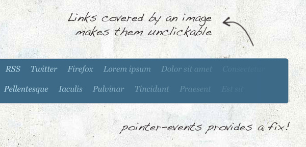
It has always bothered me that, when you place an element on top of an element, the bottom element doesn't respond to mouse events anymore. Luckily, Let's take a look at how the demo page does this: HTML<div class="shadow"></div> <div class="links"> <ul> <li><a href="http://www.marcofolio.net/">Marcofolio.net</a></li> <li><a href="http://feeds2.feedburner.com/marcofolio">RSS</a></li> <!-- More links --> </ul> </div> As you can see, nothing really fancy going on here. An empty CSS.shadow { width:800px; height:100px; background-image:url("../images/pointer-shadow.png"); position:absolute; pointer-events:none; } .links { width:800px; height:100px; } I removed all non-important stuff from the CSS script above. The Using gradients 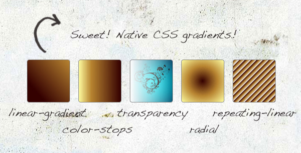
Before, when CSS gradients weren't supported, you had to create the gradient as an image and place it in the background of an element. But since Firefox added support for gradients, this is no more needed! It'll save you bandwidth, since you don't need to create any images, but a fairly easy CSS syntax is good enough to achieve the desired effect. On the demonstration page, you can find five boxes, each with another CSS gradient effect applied to it. Let's see how you can create these yourself: HTML<div class="box linear-gradient"></div> <div class="box color-stops"></div> <div class="box transparency"></div> <div class="box radial"></div> <div class="box repeating-linear"></div> Just a couple of empty divisions is enough, just to show the effect. CSS.linear-gradient { background: -moz-linear-gradient(left 40deg, #340000, #B78330); } .color-stops { background: -moz-linear-gradient(right, #340000, #B78330 70%, #FEFDA1); } .transparency { background: -moz-linear-gradient(right, rgba(255,255,255,0), rgba(255,255,255,1)), url("../images/trans.jpg"); } .radial { background: -moz-radial-gradient(#340000, #B78330, #FEFDA1); } .repeating-linear { background: -moz-repeating-linear-gradient(top left -45deg, #340000, #B78330 5px, #B78330 5px, #EEE 10px); } This is where it gets more interesting!
Pretty easy, isn't it? That'll be a great time-saver if you use gradients on your site. Multiple backgrounds 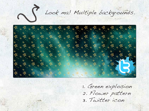
First, I want to apologize for creating a pretty ugly demonstration here. This time, I didn't go for the looks, but I just wanted to show the effect of applying multiple backgrounds to one element. Yes; multiple backgrounds applied to one element! This will keep your HTML clean for any unnecessary images (that should belong in the design) and re-use of images. But how can this be achieved? Let's check it: HTML
<div id="multiple-backgrounds"></div>
That's all we need for this example: One element where we're going to apply multiple backgrounds to! CSS#multiple-backgrounds { background: url("../images/background-2.png"), url("../images/background-3.png"), url("../images/background-1.jpg"); background-repeat: no-repeat, repeat, repeat; background-position: bottom right, top left, top right; } Just like in the previous examples, the real "magic" is in the CSS. Simply comma seperate each background that you want to apply, and you're done! Change the Note: All background images are visually placed in the order you set them in the CSS. In this case, Conclusion / Download There we go: Three new great CSS3 properties that we can now apply to your website! Although gradients and multiple backgrounds were already supported by Safari and Chrome, it's still nice to see that Firefox is applying these techniques too. They all could be really useful in specific situations.
Another addition to the CSS arsenal in Firefox 3.6 is that you can now scale your background images. I wasn't very thrilled about this, that's why I didn't add it to this article. What do you think about these newly added CSS properties? Are you happy they're added, or do you prefer another way? Please share. Tags: firefox css pointer-events gradients multiple backgrounds Interested in this topic? You might enjoy another article I've written called |


| < Prev | Next > |
|---|
| Search |
|---|
| Or try the sitemap |
Friends of Marcofolio.net
 2007 - 2018 Marcofolio.net
This (we)blog brings you information about (web)design, blogging tips, (programming) tutorials and much, much more. I can't describe Marcofolio.net in words: Just look around and be amazed. Many (new) visitors have a habit to stick around, just because of the variety of articles.
Have fun reading this blog and don't forget to subscribe to the feed to keep updated on the latest articles.