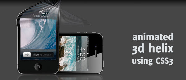
One of the most popular articles on Marcofolio.net in 2010 was the 3d animation using pure CSS3. In my opinion, it was one of the best articles for myself as well, since I learned some pretty neat stuff about CSS3 and 3d capabilities.
Shortly after I placed my article online, Chris Spooner wrote a very cool article called Super Cool CSS Flip Effect with Webkit Animation. It showed me some great other 3d techniques that can be achieved using pure CSS3.
Those two articles inspired me to create yet another very cool 3d CSS demo, that I like to call an Animated CSS3 helix using 3d transforms.
Simply go to the demo page and be amazed! I’m pretty sure you never thought something like that would be possible using pure CSS. Take note this demo only works in Safari (latest version). For those viewers that don’t have that browser, I’ve added a video below.
For those of you who start digging in the source code directly, I’m warning you: You’ll probably find one of the strangest HTML/CSS you’ve seen. This is purely created, just to achieve the desired effect. Now let’s take a look under the hood and see how it works!
Video
Here’s a reference video, displaying the demo page in the latest version of Safari and showing full effect of this demo.
How cool is that! Now let’s see how you can create something like this yourself.
The idea
Everything starts out with an idea. That idea is something you’ll keep as a reference in your mind, in order to later check if you really created what you wanted to do. This was my idea:

Seems reasonable, right?
HTML
So, let’s start with the basics: The HTML. This one is easy: We just need the 100 rows and the "Two sides" of the helix. This is what I came up with:
<ol id="container">
   <li><div></div><div></div></li>
   <li><div></div><div></div></li>
   <li><div></div><div></div></li>

   <!-- Repeat until we have 100 rows -->

</ol>
As you can see, I used an ordered list (ol), since it looked appropriate to me. Than, we create 100 rows (each one in a li). Each list item has two containing divisions (div): One for each side of the image. We’ll reference that using CSS.
That’s all we need, just a bunch of (empty) HTML containers that we’ll reference with CSS. Let’s take a look at that part.
CSS
Now we’re going to dive into the more interesting parts of this demo. First, we’ll need some basics to work with. I’ve stripped it down to the core of this effect, just to make it more clear. This part doesn’t contain any information about the animation and I’ve added some comments to make some things clear.

#container {
   /* Add depth to the rotation */
   -webkit-perspective: 1000;
}

#container li div {
   position:absolute;
   height:5px; width:500px; /* Width and height of each bar */
   -webkit-animation-duration: 4s; /* Duration of the animations */
   -webkit-transform-style: preserve-3d; /* Ensure 3d animation */
   -webkit-animation-fill-mode: forwards; /* Stop the animation at the last keyframe */
}

#container li div:nth-child(1) {
   /* Horizontal flipped iPad image is used */
   background-image:url("../images/ipad.png");
}

#container li div:nth-child(2) {
   background-image:url("../images/iphone.png");
   /* Hide the iPhone when facing the other side */
   -webkit-backface-visibility: hidden;
}
Read the CSS above and (try to) understand what it means: It’s pretty important to know/find out what all the CSS properties do and what the effect is. The :nth-child selector is used to target the first and second division in each list item, so we can create the two sides.
Now we’ll need to fix the background position for each row, so we can create the full image again (by default, the background position is set to 0 0, which means the top left corner of the image). This isn’t hard to fix.
#container li:nth-child(1) div {
   background-position:0 -0px; }
#container li:nth-child(2) div {
   background-position:0 -5px; }
#container li:nth-child(3) div {
   background-position:0 -10px; }
#container li:nth-child(4) div {
   background-position:0 -15px; }
/* Continue for all the rows */

Although the first line doesn’t actually do anything (same as the default values), I just added them to make things more clear. And since we know each bar has a height of 5 pixels, we can slightly shift them up for each bar. Take note this counts for every division found in the list item, so both the front and the back sides are handled.
This is the point where we’ll apply the animation. We’ll rotate each row across the Y-axis for a full 180 degrees (a flip). Let’s start with the first row.
#container:hover li:nth-child(1) div {
   -webkit-animation-name: flip1; }
@-webkit-keyframes flip1 {
 0% { } 100% { -webkit-transform: rotateY(180deg); }
}

#container li:nth-child(1) div {
   -webkit-animation-name: backflip1; }
@-webkit-keyframes backflip1 {
 0% { -webkit-transform: rotateY(180deg); }
 100% { -webkit-transform: rotateY(0deg); }
}
I’ll try to explain the above code in simple words:
- When you hover the container, the animation called
flip1will get executed. - The
flip1animation shows that nothing is happening at 0%, but at 100%, it’s transformed to be flipped. - The second part is when no hover takes place (initial load + when the user moves away the cursor again).
- We flip the row back again, starting at 180deg and back to 0deg (starting position).
Keep in mind the time this animation will durate, is the one set in the -webkit-animation-duration above. When this code is applied to each row, it will work. But since all the rows would have the same animation, they would all just rotate and it would look like one image that would rotate. I wanted to add a delay for each row later on.
We can do that by just adding more empty keyframes. This way, it would wait for animating until the browser sees two keyframes that it can animate with each other. Here’s an example of the 5th row.
#container:hover li:nth-child(5) div {
   -webkit-animation-name: flip5; }
@-webkit-keyframes flip5 {
 0% { }
 1% { }
 2% { }
 3% { }
 4% { }
 100% { -webkit-transform: rotateY(180deg); }
}
This is about it: Do it for each row, add the backflip animation and you’re all ready to create the helix animation!
Code generation
As you might see, we need to write loads and loads of CSS in order to achieve the full effect. Since I was pretty lazy, I wrote a small HTML and CSS generator in Java (although I’m a C# programmer, Java is pre-installed on a Mac).
I’m not going to dive into the code (some comments are added), but just wanted to share it with you to see that it isn’t hard to write this CSS file.
// What we need to generate
boolean html = false;
boolean css = true;

// HTML
if(html) {
   System.out.println("<!-- START GENERATED CODE -->");
   for(int h = 0; h < 100; h++) {
      System.out.println("<li><div></div><div></div></li>");
   }
   System.out.println("<!-- END GENERATED CODE -->");
}

// CSS
if(css) {
   System.out.println("/* GENERATED CODE BELOW THIS LINE */");
   String animationName = "flip";
   String backAnimationName = "backflip";
   for(int i = 1; i < 101; i++) {
      // Background position
      System.out.println("#container li:nth-child("+ i +") div { background-position:0 -"+ (i-1) * 5 +"px; }");

      // "Flip"
      System.out.println("#container:hover li:nth-child("+ i +") div { -webkit-animation-name: "+ animationName + i +"; }");

      System.out.println("@-webkit-keyframes "+ animationName + i + " {");
      for(int j = 0; j < 100; j++) {
         if(j < i) {
            System.out.print(" " + j + "% { }");
         }
      }
      System.out.println(" 100% { -webkit-transform: rotateY(180deg); }");
      System.out.println("}");

      // "Backflip"
      System.out.println("#container li:nth-child("+ i +") div { -webkit-animation-name: "+ backAnimationName + i +"; }");

      System.out.println("@-webkit-keyframes "+ backAnimationName + i + " {");
      for(int k = 0; k < 100; k++) {
         if(k < i) {
            System.out.print(" " + k + "% { -webkit-transform: rotateY(180deg); }");
         }
      }
      System.out.println(" 100% { -webkit-transform: rotateY(0deg); }");
      System.out.println("}");
   }
}
As you can see, this script generates:
- 100 lines of HTML code
- Sets the correct background position for each
div - Creates the correct Flip animation for each
div - Creates the correct Backflip animation for each
div
How about that for some great efficiency!
Conclusion and Download
So there you have it, a pretty nice looking 3d helix created using pure CSS3. What did you think of it? Do you see any improvements you want to make to the code? Feel free to share!
This technique also (kinda) works on iOS (iPad, iPhone etc.). Sadly, it doesn’t detect the :hover, so it only shows the initial animation. A nice feature to have, is when you rotate the device, the animation would play. Oh, and if you want a double helix (or more!), just change the deg180 to deg540 (extra 360 degrees). Have fun!