Placed in: Home  Art Most used elements in collage artwork comprar viagra en españa
comprar viagra online
comprar viagra generico barato
comprar cialis generico online
comprar cialis online seguro
comprar viagra online
comprar viagra generico barato
comprar cialis generico online
comprar cialis online seguro
| Most used elements in collage artwork |
|
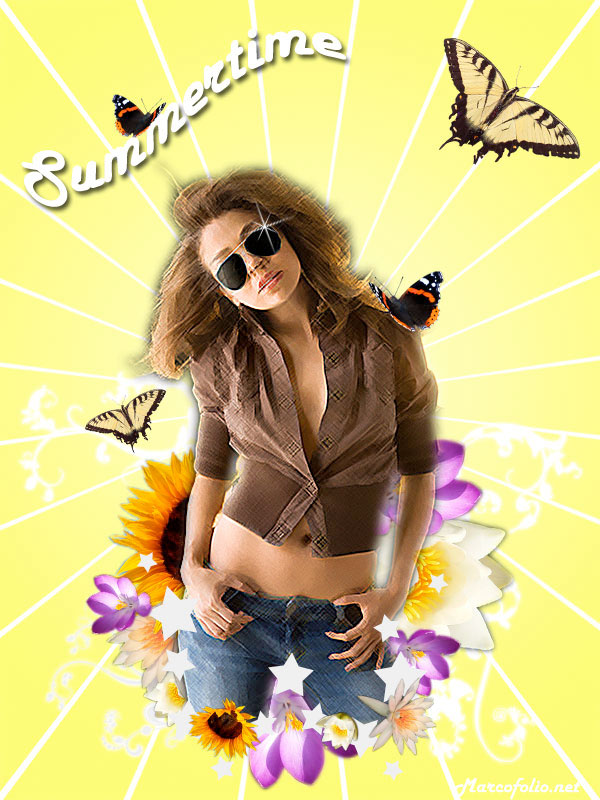
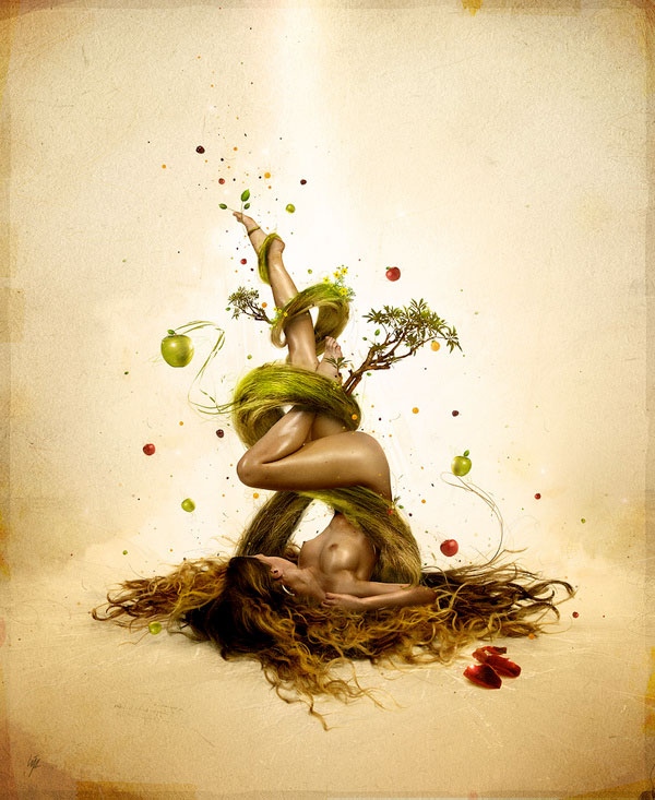
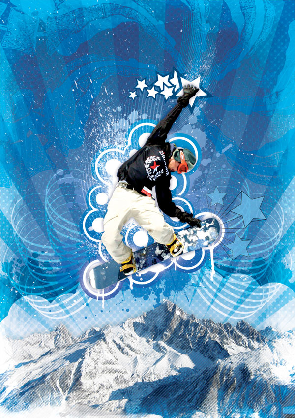
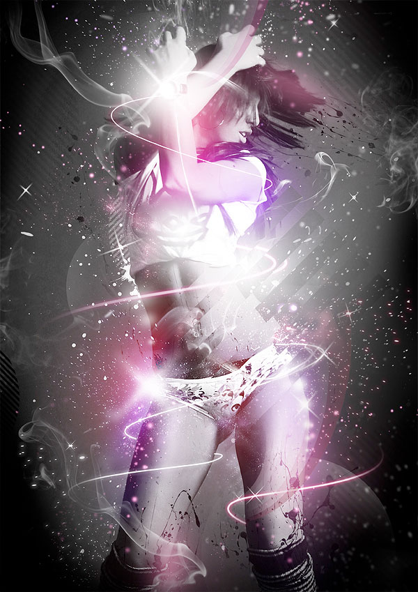
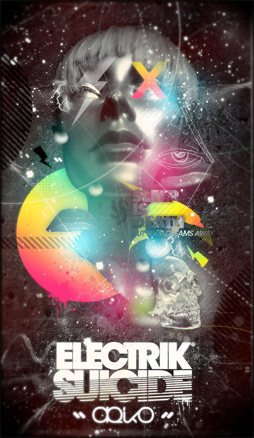
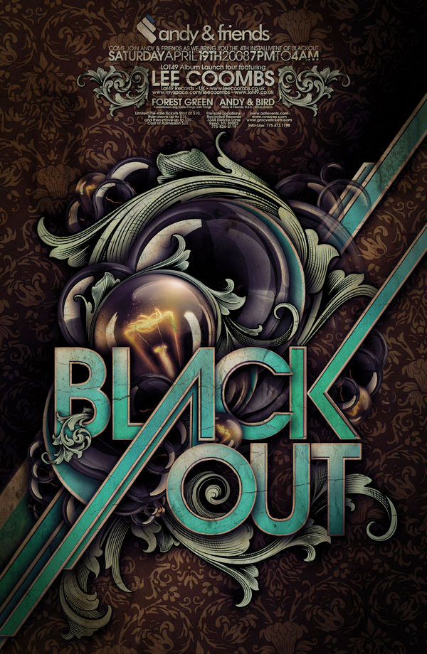
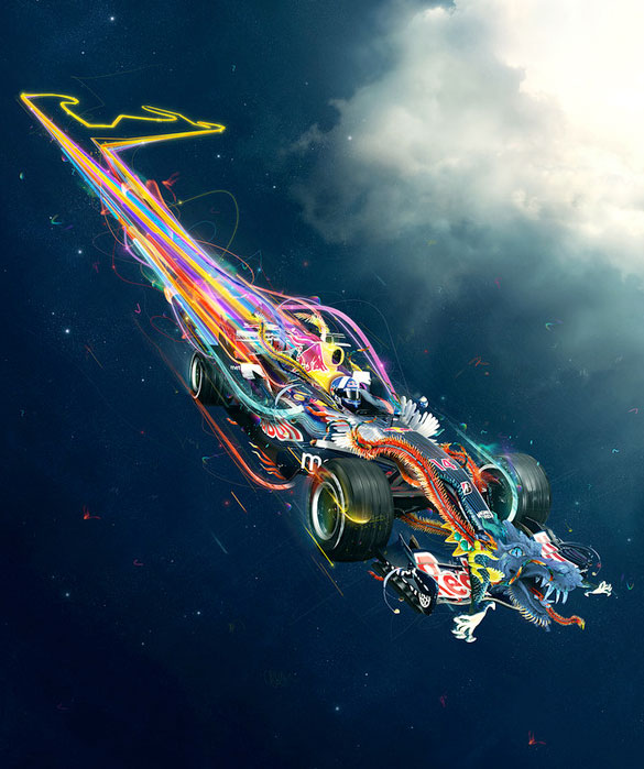
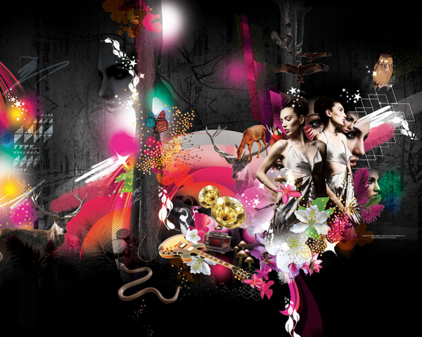
Collages, mash-ups, photomanipulations, compilations; They all are basically the same thing: Choosing a subject you want your design te be about, mix them up with some good elements and colours and produce stunning artwork. But how do you define "good elements"? This depends on the kind of design you're making. There are some kind of elements that keep on repeating on several kinds of modern design.  Of course, you must remember that this is a round-up of the most used elements at this moment. This doesn't mean that you should stick with them: Be on top of the game, but be innovative and try something new! But for now: Here's a great collection of most used elements in collage artwork. Get inspired and be amazed! Balloons
Skyscrapers / Skylines
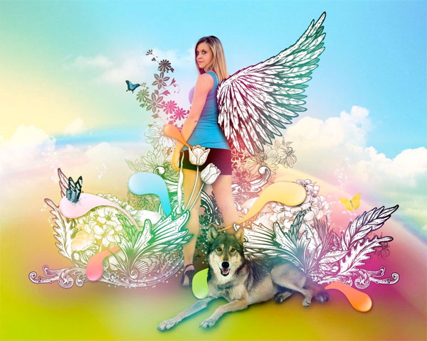
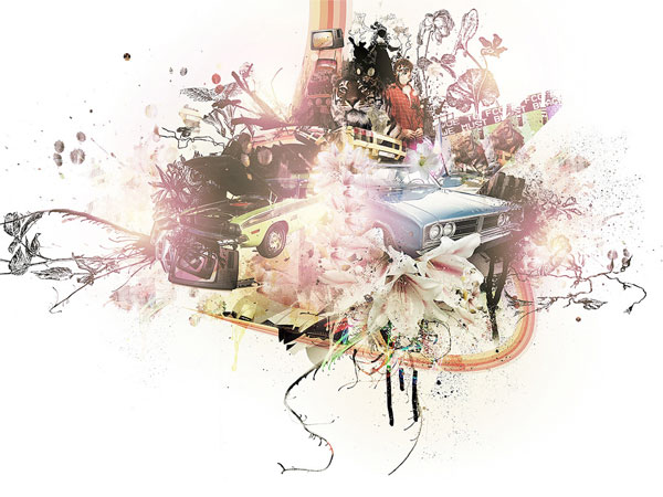
Flowers / Florals
Vector Elements / Silhouettes
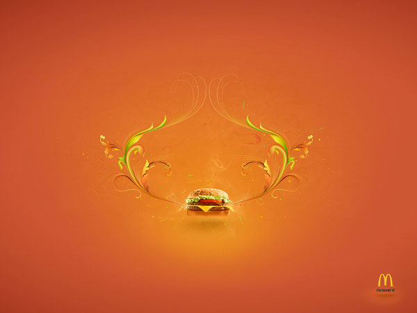
Abstract
(Big) Typography
(Vector) Rainbows
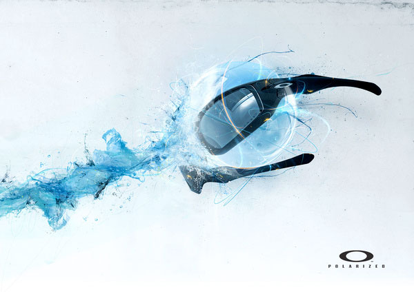
Fire / Water
Wings
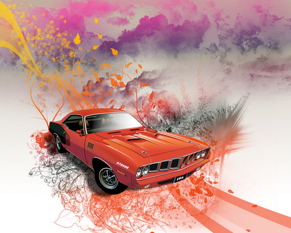
Cars
Instruments
Other objects could be colourful animals like butterflies and ladybugs. If you want more randomness, ink splatters are also used a lot. And what do you think? What kind of elements are used a lot in this kind of artwork these days? Please share! Tags: elements photoshop collage inspiration Interested in this topic? You might enjoy another article I've written called |


| < Prev | Next > |
|---|
| Search |
|---|
| Or try the sitemap |
Friends of Marcofolio.net
 2007 - 2018 Marcofolio.net
This (we)blog brings you information about (web)design, blogging tips, (programming) tutorials and much, much more. I can't describe Marcofolio.net in words: Just look around and be amazed. Many (new) visitors have a habit to stick around, just because of the variety of articles.
Have fun reading this blog and don't forget to subscribe to the feed to keep updated on the latest articles.