Placed in: Home  Art Your own CSS parallax illusion 3d image comprar viagra en españa
comprar viagra online
comprar viagra generico barato
comprar cialis generico online
comprar cialis online seguro
Art Your own CSS parallax illusion 3d image comprar viagra en españacomprar viagra online
comprar viagra generico barato
comprar cialis generico online
comprar cialis online seguro
| Your own CSS parallax illusion 3d image |
|
A couple of days ago I placed an article about a parallax illusion with CSS: The Horse in Motion. Today I'll show you how I created such an image so you can do it yourself. 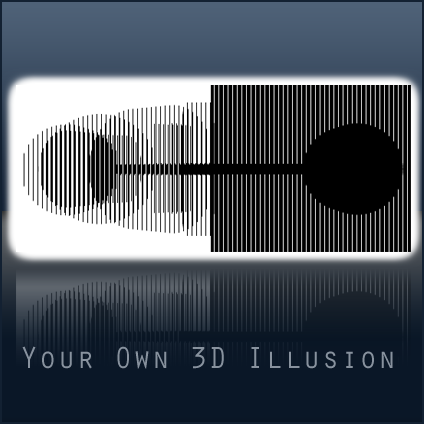 In this example, I'm going to use Photoshop for the actual image and Illustrator for the 3D effect. I wanted to try something else instead of the "frame by frame" (Like the Horse in Motion). Be creative! The final example (demo of the effect) looks pretty amazing and maybe even better than my previous one. The foreground Let's start with Photoshop. Go to File > New.. to start a new file. The size of this image is essential to understand the optical illusion and make it work. The width of the image is the number of frames you're going to use. In this tutorial and in the example I'll be using 6 frames, which means I'm going to make a foreground image of 6 pixels wide. The height doesn't matter, I just made it 10 px. Just make sure the Background Contents is set to Transparent. Now press OK to create the new file. Use your Zoom Tool (Z) to zoom in a minimal distance. Now grab your Single Column Marquee Tool and select the most outer right column. Inverse the selection by going to Select > Inverse. Give that selection a color of #000000 with the Paint Bucket Tool (G). Save this image as foreground.png by going to File > Save for Web & Devices. Make sure your preset is set to PNG-24 and have Transparency enabled. Don't close the image yet. Because we'll need this image later, define it as a pattern. Do this by going to Edit > Define Pattern. Give your pattern a name. You can now close this Photoshop file. 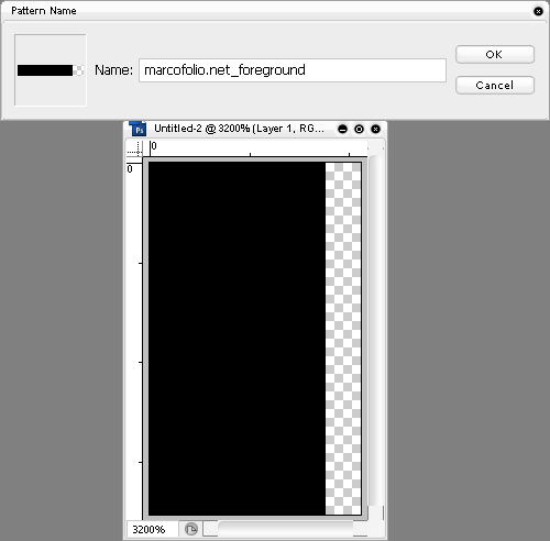 The background For the background image in this tutorial, we'll need to go to Illustrator. Draw any shape that you like, just keep in mind that it needs to rotate. The best way to draw a nice shape is by drawing circles, squares and lines. This is what I came up with. How simple can it get.  If you have multiple objects (like mine), select all objects. Now Right click > Group to make it one shape. With the shape still selected, go to Effect > 3d > Extrude & Bevel. A new window will open to set your 3d settings. I used the following settings & I recommend that you use the same. You can change the Extrude Depth and Perspective but not too much, otherwise it'll destroy the effect. Check the "Preview" box to see a live preview of your settings. 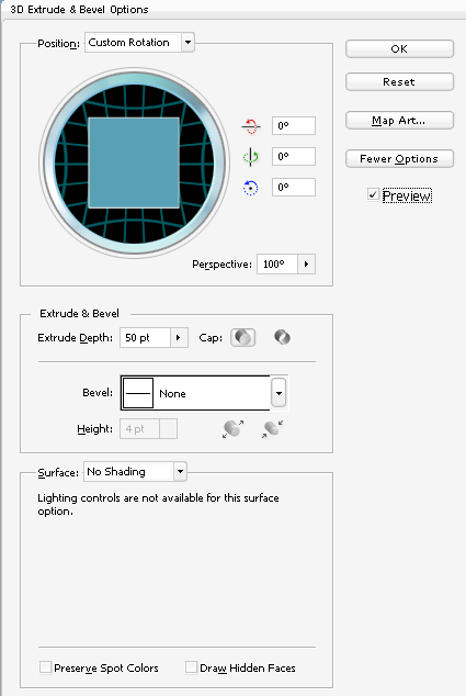 Save this image as 01.png by going to File > Save for Web & devices and also select the PNG output. Don't close the file yet, we still have some work to do. Select the object. In the tab called Appearance double click on 3d Extrude & bevel to open up your 3d settings. Depending on the number of frames, you'll need to change the Rotation of the Y-axis. I'll be using 30 degrees because I create six frames (180 degrees / 6 frames = 30). Save this file as 02.png. Keep on repeating this step, always adding the number of degrees to the Y-axis rotation (30 - 60 - 90 - 120 - 150). You should now have six images showing the rotation of your object. 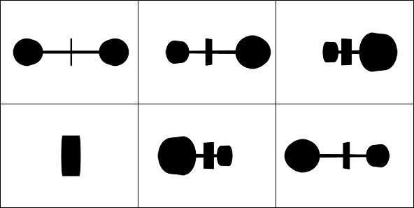 Now get back to Photoshop. Create a new file, having the same dimensions as your images that you created from Illustrator. Place all your images (01.png - 06.png) in your new Photoshop file, each one on a new layer. Give the layer a new: 01 until 06, just for a reference. Align all layers using Align Vertical and Align Horizontal to place all of them exactly at the center of your image. My example looks a little bit like a fat worm.  The following steps can hurt your eyes a little bit. Create a new layer on top of all your layers and give it a color of #FFFFFF using the Paint Bucket Tool (G). Now right-click in your layers-palette on the new layer and select Blending Options. In the new window, select Pattern overlay. Select the pattern that we made in the first step, using the default settings. Duplicate the top layer. Select them both and Merge them (Ctrl+E) to create a flat image. Now go to Select > Color range. Make sure you have Sampled colors selected and select the whitefuzziness should be set to 0. Press OK to accept the settings and a selection of all white colors is made. Press Delete to get rid of them. Here's how it should look at this point. I hide all layers 02 until 06 at this point. 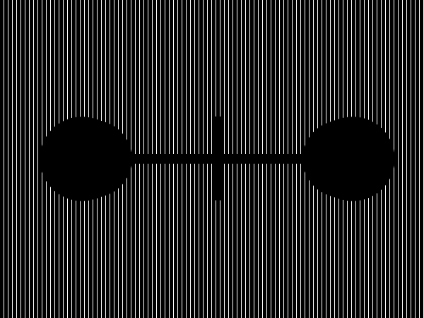 Now for the fun (but hard and confusing) part. Hide all layers, except for the foreground. Go to Select > Color range and select the black parts. Un-hide layer 01 and make sure it's the active layer. Press "Delete" to delete those columns. Don't de-select. If you want to make sure you did everything correct, your image (with the foreground layer hidden) should look like this. 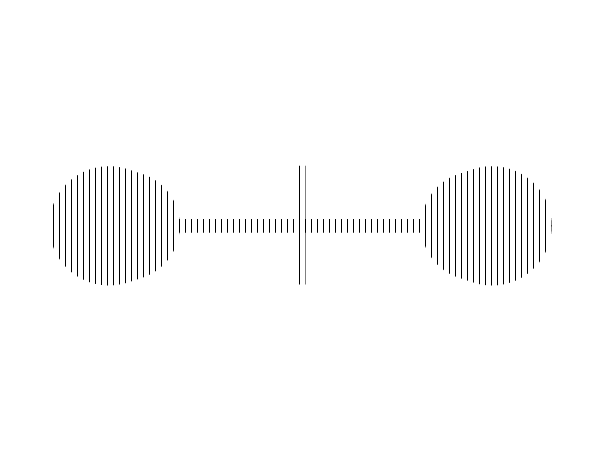 With your selection still made, hide the 01 layer. Move your selection 1 px to the right using your arrow key (Nudging). Unhide layer 02 and press Delete. Repeat this step with all layers, each time moving the selection (parts to be deleted) 1 px to the right. Now show all layers (except the foreground). This image can look pretty weird at this moment. Save the image as background.png. 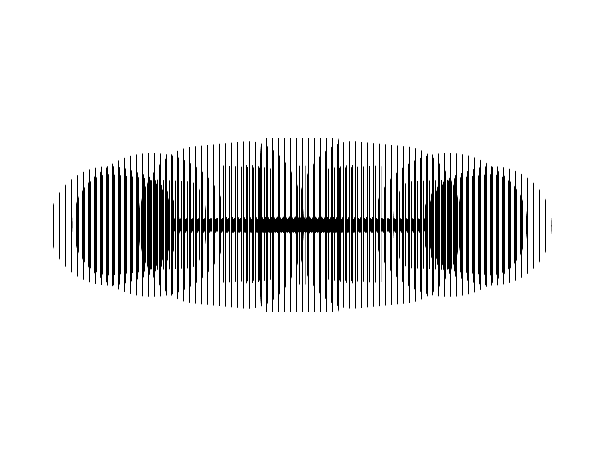 HTML / CSS / Source / Demo To understand the HTML and CSS behind this technique, I would recommend you to read the article 3d parallax background effect. The simple way is to download my source in the download section (Includes source images, HTML & CSS) to get the same results as my example demo. Conclusion I know this technique is just a "proof of concept", but it's still pretty fun to see. Also, while rotating it looks like as if the center is replaced. This is correct and caused by Illustrator. You could better use applications like 3d Studio Max for 3d images. Have fun creating your own illusion. Of course you could decide not to use Illustrator to create 3d images. You can also use six non-3d motion images like The Horse in Motion. Have fun share your creations in the comments. Tags: photoshop css illusion parallax Interested in this topic? You might enjoy another article I've written called |


| < Prev | Next > |
|---|
| Search |
|---|
| Or try the sitemap |
Friends of Marcofolio.net
 2007 - 2018 Marcofolio.net
This (we)blog brings you information about (web)design, blogging tips, (programming) tutorials and much, much more. I can't describe Marcofolio.net in words: Just look around and be amazed. Many (new) visitors have a habit to stick around, just because of the variety of articles.
Have fun reading this blog and don't forget to subscribe to the feed to keep updated on the latest articles.